Visual Display Widgets

Dewesoft X allows you to set up different display widgets for each input, for example digital meter, recorder, FFT analyser, etc. and arrange them freely in front of any graphic in your system to have a simple, but efficient overview of your measured signals.

NOTE: Primary goal of Dewesoft design online display screen is to create a clear and intelligible appearance of acquired and calculated data in different instruments on screen for review and analysis of these data. Dewesoft X allows you to set up different instruments for each input, for example, digital meter, recorder, FFT analyzer,... and arrange them freely in front of any graphic in your system to have a simple, but an efficient overview of your signals and measurement.

In Dewesoft X we know four basic types of display widgets:

- widgets which show only one value (digital meter, bar meter, analog meter, indicator lamp)
- widgets which typically show all the data (recorder, vertical recorder, xy recorder, GPS map)
- widgets which show the part of data directly or calculated (scope, FFT, octave, vector scope, harmonic FFT, tabular display)
- additional widgets like picture, text or lines

All widgets can be combined on one single screen or we can build several screens for a specific part of the measurement. Dewesoft X has few pre-defined displays but these screens can be altered or custom displays can be created with different appearances. The picture below shows a typical display with standard elements for designing the display.

DisplayWidget1Image1: Typical display widgets


You can add and adjust different widgets for each signal input.

Dewesoft X offers a variety of customizable display widgets to suit your needs.

You can set up different widgets for each input, for example, digital meter, recorder, FFT analyser,... and arrange them freely (in front of any graphic) on your system to have a simple, but an efficient overview of your signals and measurement.

To add a widget to your display you need to click on the "Widget" button and all possible widgets will appear. Click on the desired instrument to add it to the current screen. When the widget is added you will automatically enter the Design mode, where you can also adjust the size and position of the widget.

Most of the Widgets are always visible, but some of them appear only when you install specific Plugin or enable some option, for example, Power, CEA, GPS...

In this course, we will get to know all the available Widgets and describe their corresponding Properties.

ListOfDisplayWidgetsImage 2: How to add display widgets


See all possible properties and adjustments for Digital meter

The DIGITAL METER is designed to show the current or averaged value of the channel.

The digital meter has only one appearance: the channel name and units are displayed at the top left, the display type at the top right side. The main space is used by the value letters itself.

DigitalMeterBImage 3: Digital meter

 When you select a digital meter in the design or run mode, the following distinct settings will appear on left and right part of the screen:

  • Values
  • Coloring
  • Drawing options
  • Resolution

1.Values

ValuesDMImage 4: Values setting

 1.1. Value type

The digital meter can display different value types. Besides the current measurement value, timing information can also be displayed. You can choose the wanted type from the drop-down list: 

  • Channel - current measurement value, assigned to an acquisition channel
  • Time - current time of the acquisition system
  • Date - current date of the acquisition system
  • Day + time - number of the day within the current year and time of the acquisition system; this format is compatible with the timing information according to UTC
  • Elapsed time - time elapsed from the beginning of the measurement

1.2. Display Type

Your acquired signal may not be only a static signal; if you have ever tried to display a high-dynamic signal with digital values, you know that you have to make
some kind of statistic to get representative values. Therefore all instruments offer different display types, which can be selected from the Display type drop-down list:

Image 5: Display types


NOTE: All these display types represent only statistic values for the online display. The settings have no influence on other displays or data storage.

1.3. Update rate

UpdateRateDMImage 6: Update rates


With the Update rate drop-down list, you can define the update rate for the selected instrument. As a standard, the values for the display type will be calculated Fast (0.1 s) over a period of 0.1 seconds, which represents also the internal minimum calculation period.

The system will still run at the dynamic sample rate and Dewesoft X will acquire the data with full speed, calculate minimum, maximum, average and RMS for this time interval, however, every data point will NOT be displayed on the instrument and stored, but only these calculated values.

When From reduced rate mode is selected, the system will reduce the data continuously according to the static/reduced rate selected in STATIC/REDUCED RATE drop-down list in the channel setup.

2. Coloring

ColoringDigitalMeterImage 7: Coloring settings


In the coloring option, you can edit the default Normal color for the displayed numbers on the widget and set high and/or low alarm limits for each instrument, which will cause the instrument number to change from normal color to red when it is either above the high limit or below the low limit.

Check the check boxes to activate/deactivate high or low limit detection. If enabled, you can enter the custom value level for each.

For example, if we want to have the signal change to red when it either falls below 1 or rises above 5V, we set this meter up accordingly (see Image 6).

Note that the number changes to red as a standard when it is outside of both limits and remains green when it is within the limits. You can set Lower limit, Upper limit, or both limits for each meter.

If you want to change any of the colors simply click on the colored field and choose the desired color from the appearing color selector window.

NOTE: The upper and lower limit is only a visual effect; it is completely independent of the Alarm monitoring function.

3. Drawing options

Drawing-options-DMImage 8: Drawing options

 In Drawing options we can edit two different things:

  •  Use digital fonts
  •  Show caption

When Use digital fonts check-box is ticked:

DMFonsBImage 9: Use digital fonts enabled

 When Show caption Check-box is ticked:

DigitalMeterBImage 10: Show caption enabled 
When Show caption Check-box is not ticked:
DigitalMeterWithoutCaptionBImage 11: Show caption disabled


NOTE: As standard, the caption is displayed.

4. Resolution

Sometimes it is useful to be able to add one or two digits of display resolution or delete one or two, according to the type of data being displayed.

Select a meter by clicking once on it. If Automatic is checked, click either + (increase) button or - (decrease) button to add or delete digits to the right of the decimal point of the meter‘s display.

Auto-ResolutionImage 12: Automatic resolution

If Automatic resolution is not checked the resolution can be adjusted manually. Instead of + and - button Leading and Trailing field is displayed to enter the number of digits.

Manual-ResolutionImage 13: Manual resolution

 Below this also the Exponent section appears. With plus and minus button define exponent E in the step by +/- 3. 

See all possible properties and adjustments for Analog meter

The ANALOG METER is designed to give a graphical indication of the current value of a signal within the defined display range.

When you select an Analog meter in the design or run mode, the following settings will appear on the left and right part of the screen:

AM2Image 14: Analog meter
  • Values
  • Coloring
  • Drawing options
1.1 Display type

Your acquired signal may not be only a static signal; if you have ever tried to display a high-dynamic signal with digital values, you know that you have to make some kind of statistic to get representative values. Therefore all instruments offer different display types, which can be selected from the Display type drop-down list.

DisplayTypeAMImage 15: Display types


NOTE: All these display types represent only statistic values for the online display. The settings have no influence on other displays or data storage.

1.2. Update rate

UpdateRateAMImage 16: Update rates


With the Update rate drop-down list, you can define the update rate for the selected instrument. As a standard, the values for the display type will be calculated Fast (0.1 s) over a period of 0.1 seconds, which represents also the internal minimum calculation period.

The system will still run at the dynamic sample rate and Dewesoft X will acquire the data with full speed, calculate minimum, maximum, average and RMS for this time interval, however, every data point will NOT be displayed on the instrument and stored, but only these calculated values.

When From reduced rate mode is selected, the system will reduce the data continuously according to the static/reduced rate selected in the STATIC/REDUCED RATE drop-down list in the channel setup.

1.3. Minimum and maximum shown value

You can define a Minimum and a Maximum shown value for the analog meter; this feature is very important to get a better scaling for the display.

You need to check the check-box and then just enter both values and the bar graph scaling will change immediately.

MINMAXValueAMImage 17: Min/Max value settings


NOTE: This way changing the Time axis can't be done in Design mode -> available only in Run mode.

3.Coloring

ColoringAMImage 18: Coloring

 You can set high and/or low alarm limits for each instrument, which will cause the instrument area to change from Normal color to default red color. Use check-boxes to activate/deactivate high or low limit detection. If enabled, you can enter the alarm level for each.

For example, if we want to have the signal change to red when it either falls below 1 or rises above 5V, we set this meter up accordingly (see image 17).

Note that the area of low or high limit color changes to red as a standard. If you want to change the limit color simply click on the colored field next to the high or low limit and choose the desired color from the appearing color selector window.

NOTE: The upper and lower limit is only a visual effect; it is completely independent from the Alarm monitoring function.

3. Drawing options 

The analog meter offers four different appearances and can be selected from an Analog meter type list. You can choose the wanted meter type from the drop-down list. 

Image 19: All drawing options


The HORIZONTAL/VERTICAL BAR GRAPH is designed to give a graphical indication of the current value of a signal within the defined display range.

When you select a Horizontal / Vertical bar graph in the design or run mode, the following distinct settings will appear on left and right part of the screen:

  • Values
  • Coloring
  • Drawing options

Some of the settings are the same as the ones that we already described in previous widgets. These are the new ones:

1. Meter type

The bar graph has four different basic appearances: a 2D, 3D, Needle, or LED bar graph and can be selected from the Meter Type drop-down list. They all contain the channel name, display type, and unit beside the measurement values.

AllTypes2Image 20: All possible bar meter types

 All bar widgets basic appearances can be in horizontal format- Horizontal bar or in vertical format - Vertical bar.

BothDirectionsBARImage 21: Horizontal and vertical format

 The orientation depends on the instrument type selected in the Widget menu. Changing the orientation is not possible; you have to select the right instrument.


The DISCRETE DISPLAY is designed to show defined discrete value, to supervise the value analog signals in a true/false way.

Each channel can have a set of predefined values - for example, a binary CAN channel for ABS can have three states with codes 0, 1, and 2 which represents ON, OFF, and ERROR. 

The Discrete Display instrument shows a defined discrete value. For Discrete display mode, you are able to set  

  • Values
  • Drawing options
  • Discrete display 

Some of the options are already described in previous chapters, but these are the new ones:

DiscreteValuesImage 22: Discrete values

 1. Define Discrete values


If the discrete values are not defined, we can define them for selected channels by pressing the Define button. Define discrete values window will appear 


DefineDescriteDisplayImage 23: Define discrete values

In this window you can define:

  • Value - numerical code for each state which only accepts integer values
  • Name - description of each state
  • Color - Color of the certain state
  • Picture - after a click on this field Load graphics window appear to define .bmp or .jpg picture. The picture will be shown at a certain code in a discrete display (a green lamp for on and a red lamp for off, for example).

With the Plus button you can add another value, and with the button delete value (table row).

2. Show

You can either display a Value, Picture, or Value and a picture.

DiscreteDisplayImage 24: Value and a picture display

 3. Show undefined values

When the check-box is checked also undefined values are presented in the Discrete display. If the check-box is unchecked the discrete display shows NO VALUE message.

NOValueDiscreteImage 25: Show undefined values disabled


The INDICATOR LAMP is designed to show the state of digital signals, to supervise the value of Analog signals in a true/false way, but also to show Discrete values.

The Indicator lamp is quite a simple element and displays next to the channel name only a colored lamp, depending on the settings.

Image 26: Indicator lamp

For example, when the temperature drops below 40°C, the lamp becomes green. As soon as the Temperature grows above 40°C, the lamp becomes red.

When you select Indicator lamp, the following settings will appear on the left and right part of the screen:

  • Values
  • Coloring
  • Drawing options

1.1. Value type

Possible Indicator lamp settings depend on the selection in this field. For the Indicator lamp, you can select among three basic Display values: Channel, Alarms, and Storing.

ValueTypeILImage 27: Value types

Channel: Channel shows the state of digital signals helps you supervise the value of analog signal current measurement value, assigned to an acquisition channel in a true/false way

Three colors can be chosen - below a first limit, in between limits and above second limit.

For the Channel option, you are able to set the Display type and Update rate. Both are already described in the previous chapters. 

Alarm: Alarm will show the state of alarm signals

AlarmILImage 28: Alarm value type


Two colors can be chosen - When the chosen alarm is OFF and when the alarm is ON. 

Storing: Storing shows the state of storing data. If data is stored, the lamp will go red, otherwise, it will stay grey.

StoringILImage 29: Storing value type

If you want to change the color of Indicator Lamp in any of the wanted state simply click on the colored field and choose the desired color from the appearing color selector window.


Together with other different data of measurement in various instruments Dewesoft X provides Overload indicator display to show list information about overloaded signals.

OVLIndicatorImage 30: Overload indicator

 The Overload indicator displays in tabular form channels information about:

  • Index
  • Name
  • Description
  • Unit
  • Sample rate
  • Values
  • Status

In the Values column also channel min and max values are displayed as yellow lines, bar graphically shows the current levels of the signal with their limits. In the Values column, overloaded signals are designated graphically.

1. Display type

The Overload indicator display can show channel information for:

  • All channels
  • Selected channels
  • OVL & alarm channel

Select the Display type from the drop-down list according to your requirements.

When we select All channels option then the Overload indicator information for all channels gets displayed.

When we select Selected channels then an empty Overload indicator appears. In Channel selector, a list of all available channels appears. From this list, we can choose channels to display it in the Overload indicator table.

2. Column selection

Dewesoft X allows us to select columns that are displayed on the Overload indicator list.

TabularColumnSelectionImage 31: Column selection

 Simply tick the box in Column selection in front of the desired column name to show this column on the Overload indicator.

3. Values display

You can choose what type of values are displayed on the OVL indicator from the drop-down list.
DisplayValuesOVLImage 32: Values displayThere are also two additional check-boxes if the first one is checked the overload status is frozen and if the second one is checked the cart/warn status stays frozen.

Dewesoft X provides together with other different instruments also Tabular values display to show list of all the measured data and related time.

Tabular2Image 33: Tabular values display

 When you select Tabular values to display in the design or run mode, the following settings will appear on the left part of the screen:

  • Display type
  • Display options
  • Print format
  • Font

1. Display type

The Tabular values table displays in separate columns:

  • Channel values
  • Cursor values
Image 34: Display types

 2. Display options

DisplayOptionsTabularImage 35: Display options 
The Tabular values display offer three possibilities:

- Display time

When we select this field check-box, time data from measurement start in predefined format is displayed, if it is not checked, the Time column is hidden. All values of the selected channel are displayed.

- Absolute time
When we select this field check-box, the date is displayed additional in absolute time format. All values of the selected channel are displayed.

- Print on value change only
When we select this checkbox, an additional part of Tabular values setting - Change threshold section is displayed (description see below). Only selected channel values that meet the condition that is defined in the Change threshold field are displayed.

TabularChangeThresholdImage 36: Change threshold

 3. Print format

Select the Scaled or Raw type from the drop-down list according to your requirements 
PrintFormatTabularImage 37: Print formats


Usually, the scaled value is displayed, but sometimes it is nice to see the raw channel values, especially when data is transmitted digitally (CAN, PCM, or other digital buses).

When Raw type is selected, then a new field appears. You can select between the Hex, Decimal, Octal or Binary format types from the drop-down list according to your requirements. This is valid only when raw values will be displayed.

PrintFormatTabular2Image 38: Raw value formats


Image 39: Different scaling formats. Scaled, Raw - decimal, Raw - Hex

 4. Font

You can change the font size, color, or you can change the font style as Bold. 

FontTabularImage 40: Font options

1. RECORDER

The Recorder instrument is designed to show the time-history like the traditional strip chart recorder, but with enhanced display and analysis capabilities.

When you select Recorder instrument in the design or run mode, following distinct settings will appear on the left and right part of the screen:

Recorder settings

  • Interaction
  • X-axis
  • Y-axis
  • Drawing options

Appearance on the screen:

The Recorder element offers all the important information like channel names, units, time information, and zoom functions.

Recorder-appearenceImage 41: Recorder appearance

1. Interaction:

When you switch to the User notes option, you can add a user note to the graph. You can select the area or sample of the graph where you want the note. After you select the area the Edit marker will appear, where you can add custom note or adjust other parameters:

Recorder-interactionImage 42: Recorder interaction

2. X-axis

From the drop-down lists, you can select the Tick type and the display of time on the x-axis. There is also an additional option Single time axis, which is useful when you stack recorder widgets vertically. When this is enabled all the recorders will only have one x-axis.

X-Axis-RecorderImage 43: X-axis options

 3. Y-axis


From the drop-down list, you can select the tick type and the display type of the data. Because the Recorder is typically used to show longer periods of time - minutes or even hours or days - it has the added ability to show data in one of several fashions: Real Data, RMS, or Average.

Y-axis-recorderImage 44: Y-axis options

Select any graph by clicking on it, and then select the Display type from the selector. This is useful when monitoring AC signals, which are going to look like a solid band when the long duration is shown and is helpful (unless you're just looking for overall amplitude envelopes or obvious drop-outs). Changing the display type for this graph to RMS will show a more useful representation of the data.

For noisy DC signals, selecting Average can clean up the display.


IMPORTANT: Be aware, that all these display types represent only statistic values for the online display. Settings have no influence on the other displays or the data storage.

Just have a look at the following screen to see the difference between the three display types.


Recorder-RMS-Average-RealValueImage 45: Different display types

 4. Drawing options

You have a lot of available drawing options for the recorder.

Drawing-options-recorderImage 46: Drawing options

Use the Show events checkbox to enable or disable the view of event markers. You can also see all your events - keyboard, notice, and voice types - on the event list at the top right, directly below the replay control button. 

Use Compact Y-axis to reduce the size of the Y-axis area where the names of the channels are displayed.


2. VERTICAL RECORDER

The Vertical recorder instrument is designed to emulate the time-history plotting capabilities of the traditional strip chart or recorder, but with vertical Time axis orientation and enhanced display. On each vertical recorder only one channel can be displayed.

Appearance on the screen:

The Vertical recorder element offers all important information:
- channel number (group, description, and slot)
- channel name(s)
- unit(s)
- time information
- zoom functions...

Appearance is like for Recorder, except the Time axis is vertical.

vertical-recorderImage 47:Vertical recorder

Vertical recorders have similar options as horizontal recorder. But it also has one additional property Alarm Levels. 

Alarm levels


You can set high and/or low alarm limits for each Vertical recorder, which will cause the recorder to mention the alarm above the grid. As a standard, the alarm values are set to the minimum and maximum range for the appropriate channel. If you want to use your own limits, just enter the alarm level according to your requirements.

Alarm-levelsImage 48: Alarm levels 


Now we have set the limits to +1 and -1 mm, indicated by the two small white lines directly above the scale. The two yellow lines show the minimum and maximum value during this acquisition, which may be even outside the displayed time window. Finally, a line in the color of the channel indicates the current value; a small line indicates just small changes in the signal for the last 0.1 sec, the wider the line the higher the change in the signal.  

Picture 1: The current signal is within the defined limits of ±1 mm, indicated by the two white markers.
Picture 2The signal is out of the defined limit, the current value is displayed in red letters as long as the signal is out of the limits.
Picture 3:The signal is back within the limits, the previous exceed of the limit is indicated by the three red !!!. You can also still see the maximum level indicator out of the limits.

Alarm-leves-examplesImage 49: Alarm levels examples

 If you want to change the X-axis for any input, the recorder offers two possibilities:

- Enter values 

You may enter the values by yourself - simply click on the number at both extreme and then type in a new number.

Manual-Scaling-recorderImage 50: Manual scaling

 - Autoscale

Move the cursor to the axis scale. Press the left mouse button to activate the auto scale for this channel or press the right mouse button to undo auto-scale. The autoscale function always calculates the minimum and maximum value of the currently displayed signal and use these values for scaling. The scaling will be only updated when you press the left mouse button.


Autoscale-recorder1Image 51: Auto scale Additional Auto scale functions


Dewesoft X offers additional auto-scale functions when you press keys together with the left or right mouse button:

Left mouse button - Auto scales the selected channel (see also above).

<SHIFT> + Left mouse button - Scales the selected channel symmetrical around zero (± values are the same).

Right mouse button - Undo auto scale for the selected channel (see also above).


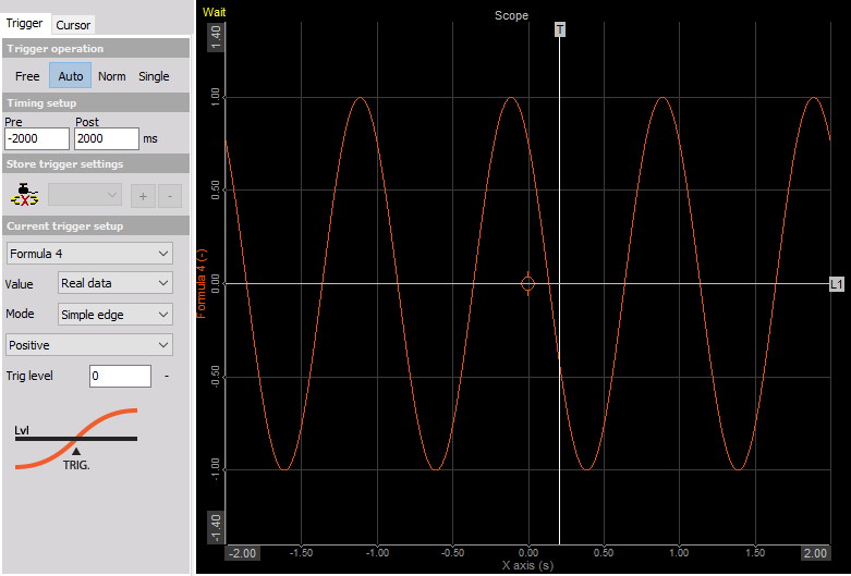
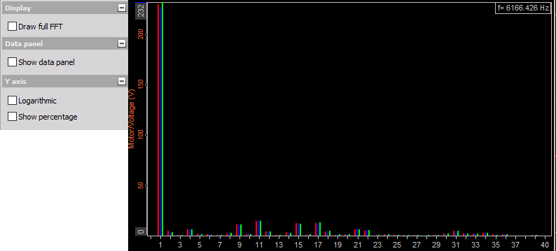
The Scope instrument is used for displaying fast, short-time events. Like in a traditional scope you can define trigger conditions. Up to 16 inputs can be displayed at once in each graph.

Scope-widgetImage 52: Scope widget in Auto trigger operation


The Scope element in the overview offers all important information:
  • channel name(s)
  • unit(s)
  • time information
  • zoom functions...

When the scope is not triggering, the bar on the right side shows the current levels of the signal so we can optimize the trigger level according to the normal values (we can also use Auto trigger mode). When the trigger is lost for some seconds, data will be shown none triggered.

Scope-Bar-on-the-rightImage 53: Bar on the right, which represents the none triggering time

Run mode Zoom (additional appearance setting)

At the top right above each graph in Norm or Arm Trigger mode, you maybe have already noticed a small icon. Pressing it enables/disables the zoom view during acquisition. Up to now, when you press the blue + and - buttons at the bottom right side of each graph, you also changed the memory depth used for the acquisition.

loop-in-scopeImage 54: Loop sign

If we want to see the event now more detailed, just click the zoom icon. At the top of the graph, you will now see a scroll bar indicating the current displaying position within the whole acquired signal. Press the + button to zoom in (or - to zoom out).


Scope-2Image 55: Zoomed area in Scope

When you move the mouse over the scroll bar at the top, it will change its appearance to a "hand". When you press the left mouse button and move the mouse, you can change the current position and scroll through the whole acquired data of the current trigger shot.

The Scope instrument typical settings include three main groups:

- Trigger (Free run, Auto, Norm, Single)
- Cursor (cursor measurement to show the cursor readouts for each channel within the selected scope; with Reference curves possibility)
- Scale (to change displayed offset and scaling of signals)
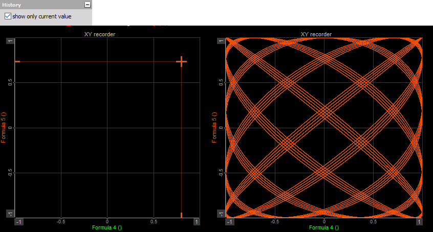
- History (to display the trigger events in different ways history type, to select how many trigger events will be used, to browse through the trigger events, to export the acquired data)

1. Trigger settings

Dewesoft X knows four types of Trigger operations: 

FREE RUN (All values are displayed, no trigger active and there are no additional settings)
Free-RunImage 56: Free run option

 AUTO (The auto-trigger displays values if the trigger condition is true; when there is no trigger within some time, it displays the current value) For this type of Trigger operation we can set:


  • Timing setup
  • Current trigger setup with:

- select the desired channel
- define the Value
- define the Mode - trigger type
- setup trigger condition for selected trigger type:

Auto-runImage 57: Auto modeMode

- simple edge
- filtered edge
- window
- pulse width
- window and pulse width
- scope

  • Store trigger settings

- NORM (The normal trigger displays only values if the trigger condition is true)

For this type of Trigger, the operation can be set in the same setting as for Auto trigger.

When the Norm (or single) trigger is selected, another tab appears -> History.

Scope-normImage 58: Norm mode

 - SINGLE (This function can be used to acquire single events)

After selecting Single button, this button changes to Rearm.

Single-mode-scopeImage 59: Single-mode

 Press it to get another single-shot event.

For this type of Trigger, the operation can be set in the same setting as for Auto trigger. When the Single (or Norm) trigger is selected, another tab appears - History.


2. The timing setup

Timing-setup-scopeImage 60: Timing setup

 The Timing setup can be used to define the displayed Pre and Post trigger time in milliseconds.

HINT: Like the trigger level, the trigger position can be changed within the displayed time window by moving the white vertical line in the scope graph. Simply click on the line, keep the mouse button pressed and move the line to the desired position.

The time window can also be changed using the blue + and - buttons at the right bottom of each graph.

3. Current trigger setup

The trigger conditions for Auto, Norm, and Single data triggers are the same and work in the same way as described in Using a trigger to start and stop recording.

1. select the desired channel
First of all you have to select the desired channel out of the drop-down list. It displays all available channels.

Channel-selector-scopeImage 61: Channel selector

 2. define the Value

Select the Real data, Average, or RMS from the drop-down list.


Define-a-value-scopeImage 62: Define value

 3. define the Mode

Select the trigger type Simple edge, Filtered edge, Window, Pulse-Width, Window, and pulse-width or Slope from the drop-down list.


Define-mode-scopeImage 63: Define mode

4. Setup other
These settings (e.g. Slope, Trigger level, Rearm level, Pulse time,...) depend on selected trigger type in Mode field.

HINT: The trigger level can also be changed by moving the white vertical line in the scope graph. Simply click on the line, keep mouse button pressed and move the line to the desired position.

3. Store trigger settings

This is a very nice function to define the storing options directly within the scope.

Any changes done here are automatically copied to the system trigger and vice versa. To activate this function press the Link store trigger button.

The drop-down list next to the button shows - if already available - existing triggers conditions or starts with a fresh entry T0.

Store-trigger-scopeImage 64: Store trigger The + button can be used to define additional conditions, which can be selected by the drop-down list and changed according to your requirements.


The - button can be used to delete selected additional conditions.

WARNING: As long as the Link storage trigger button is not pressed, the data is only displayed - not stored!
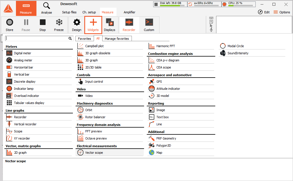
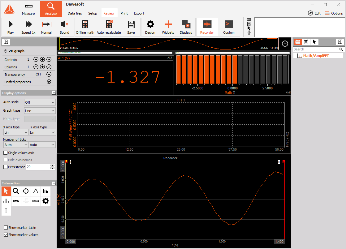
The XY recorder is designed to display channels versus channels; there is no direct time relation.

The only difference to time-based displays is that the first selected channel is always used as the X-axis channel.

The X-Y recorder element can display up to three Y-axis channels, related to one other channel on the X-axis at the same time.

x-y-recorderImage 65: XY recorder

 The yellow cross on the XY recorder indicates the latest displayed value.

Graph type

Graph type knows four modes:

XYR-graph-typeImage 66: Graph type
  • Single x-axis - Allows only one channel x-axis. The first assigned channel is used for the x-axis, up to 4 following channels the y-axis.
  • Pairs of x-y - allows defining multiple "sets" of XY channels. First, select the channel for the x-axis, then select a channel for the y-axis. This function allows you to refer different channels to different x-axis. NOTE: You still have only one x and y scaling. For example: x = distance 1, y = pressure 1. Now do the same for the second set, x = distance 2, y = distance 2.
  • Angle based XY - The first x-axis channel is the reference channel of the angle. It should go from 0 to 360°. The second (and further channels) are angle related data (like rotational vibration - XY recorder now displays the rotational angle of current revolution). This XY recorder is like a scope, but with angle reference instead of time reference.
  • Polar graph

Display type

Dewesoft X X-Y graph is now able to display the Real data. You can display also Average (for slow signals) or RMS values (for dynamic signals). As a standard, the values for the display type will be calculated over a period of 0.1 seconds.

XY-Recorder-Display-typeImage 67: Display type

Be aware that all Average and RMS display types represent only statistic values for the online display. The settings have no influence on the other displays or the data storage.

The angle-based type for Angle based XY recorder can be selected between 360° and 720°.

Angle-based-typeImage 68: Angle based type options

 You can display signals over a 1 period or 2, 3, or 4 periods which can be selected from drop-down list.

Number-of-periodsImage 69: Number of periods

 X and Y tick Types

The X-Y recorder offers different Tick types for the X and Y-axis. You can select between Automatic, Step, and Division type. For Step and division type you can define a custom number of ticks

Tick-type-XY-recorderImage 70: Ticks types


The Single value axis checkbox can be used to set all active channels of an X-Y recorder grid to only one Y-axis. If set, all channels will use the same scaling and as a visual result, there will be only one axis with values left. This function is very helpful when there is only a small space for channel names and scaling and the channels use the same scaling.


Show-Values-Y-Axis-XY-RecorderImage 71: Single values Y-axis

 Buffer

An option Load all buffer can be accessed only in Analysis mode. It shows all the cycles in the data file, not only the selected region.
Load-all-bufferImage 72: Load all buffer

 History

When the signal is changing very strong, it may be helpful to click the Show only current value checkbox in History section; this removes all displayed values from the X-Y graph and shows only the current value. Show only current value checkbox in History section; this removes all displayed values from the X-Y graph and shows only the current value.

show-only-current-value-XY-recorderImage 73: Show only current value


Unselect this feature to receive the whole signal history again.


Draw filter

Especially for run-up tests, you should use the Only when x increases checkbox in Draw filter section. This is only a drawing filter and avoids any values displayed which become smaller than before.

Draw-Filter-XY-recorderImage 74: Draw filter

 Drawing options

By enabling the Draw sample points option, we display also the sample point together with the lines, connecting them.

Draw-sample-points-XY-RecorderImage 75: Draw sample points


Draw only sample points that do not display any lines between the sample points.
Draw-only-sample-points-XY-RecorderImage 76: Draw only sample points


X and Y directions can be in linear or logarithmic scale.


Logx-LogyImage 77: Caption


For Pen up option, we need another channel, that will change its value between 0 and 1. When the value is 0, the XY recorder is writing and displaying data and when the value is 1, the recorder is not displaying data.


Pen-Up-XY-RecorderImage 78: Pen up function


With  Pretime limit we define the number of displayed samples.


Pretime-limit-XY-RecorderImage 79: Pretime limit 

 Cursor type

The Delta cursor shows the changes in the X direction (dX) and Y direction (dY) between the selected point on the graph (P1, P2). From the changes in both directions, also the angle of the straight line between the points is calculated.

Cursor-type-XY-recorderImage 80: Cursor type

 Show cursor

When the Show cursor is disabled, the Yellow cross cursor is not displayed on the XY recorder. 

show-cursor-XY-recorderImage 81: Show cursor 


Dewesoft X 2D graph shows the drawing of any matrix channels. Some typical examples are FFT created from math channels, classification and others.

When you select 2D graph, following distinct settings will appear on left and right part of the screen:

  • Control properties (adding widgets, transparency, number of columns)
  • Display options (Auto scale, graph type, ....)
  • Interaction (markers and marker table)
  • Channel selector (for assigning and reassigning the channel on graph)


2D-graphImage 82: 2D graph

 The input to the 2D graph can be:


  • FFT math
  • STFT math
  • CPB math
  • classification
  • counting
  • scope trigger
  • FRF math
  • SRS math
  • CA pressure and other channels

In short, a 2D graph can show any array channel created by Dewesoft X.

Display options

There are several properties that can be set to 2D graph.

Auto scale
Auto-scale-2D-GraphImage 83: Autoscale options

  • Off - the channel will not be scaled automatically, we enter the min and max of the range
  • Per channel - each channel will be scaled according to its range
  • All channels - all channels will be scaled to the same range (to the range of a channel with the biggest amplitude)

Graph type

Automatic will set the graph type to what is set in the input channel. For example, FFT has the default graph type of lines while CPB has the histogram. We can override these settings by manually defining either Line or Histogram.

Graph-type-2D-graphImage 84: Graph type 
  • Line 
line-2d-graph-typeImage 85: Line graph type 
  • Histogram 
histogram-2d-graph.typeImage 86: Histogram graph type

 Histogram type for histogram type, we can define to either fill the bars with Full option, or to draw empty bars with Empty option or to simply draw the Line at the top for a very classical instrument look.

  • Full option
    Full-Histogram-2dImage 87: Full Histogram type 
  • Empty
    empty-histogram-2D-Graph2Image 88: Empty Histogram type 
  • Line
    line-histogram-2D-Graph2Image 89: Line Histogram type

The X-axis type can be either linear or logarithmic. Y-axis can be:

  • linear
  • logarithmic
  • 0 dB - Scale in dB gives the best estimation of signal noise - if 0 dB is the maximum measurable value
  • Sound dB - the equation for calculating dB is: 20*log10(p/p0) where the p is our value and p0 is the reference of 20 uPa
  • Ref. dB - with the Ref. dB we define our own reference value

    xy-axis-typesImage 90: X and Y axis types

Number of ticks defines either automatic or manual number of graph divisions for x and y-axis. Division for y-axis can be freely defined only for linear scaling, log scaling defines the number of ticks from minimum and maximum axis value.


Number-of-ticks-2d-graphImage 91: Number of ticks

Single value axis option will set one y-scale for all channels in the graph.


Single-Value-Axis-2d-graphImage 92: Single values axis

 With the Hide axis name option, we hide the name of the assigned channel - only the y-axis scale is shown.


Hide-axis-names-2d-graphImage 93: Hide axis names

 Persistence will slowly fade the old data on the graph. We can define the number of old arrays to be shown. The larger the number, the more history will be seen.


persistanceImage 94: Persistence


Interaction

The 2D graph can display values of the currently selected point with the markers. When clicking on such point with the left mouse button, the marker line will be added showing x-axis value on the x-axis and showing y-axis value of certain point above the marked point. All points can be removed by pressing the right mouse button.


Interaction-2d-graphImage 95: Interaction

 The type of markers:


  • selection
  • zoom
  • free marker
  • max marker
  • harmonic marker
  • sideband marker
  • RMS marker
  • damping marker
  • cursor channel
  • bearing marker

You can find out a lot more about markers, how to add and use them is the Spectral analysis with the FFT course.

Marker table shows the ID, color and the coordinates of the markers (X and Y-axis value). We can make markers visible or not and edit them (change the position of each marker).


Show-Marker-tableImage 96: Show marker table 


The Show marker option shows the amplitude and the frequency of different markers, put on a 2D graph.


Show-marker-valueImage 97: Show marker values


Campbell plot or diagram enables us the visualization of 3-dimensional values on a single plane. It is mostly used in the Order tracking.

Range of values is segmented in a defined number of levels and each level is represented by a circle, whose radius and color depend on level's index; bigger values are represented with larger circles and colors higher on the color map. For a better analysis of data, the cutoff of lower levels can be applied.

This instrument works based on the classification of the measured values, with several options for diagram design and adjustable properties of classes. It can be applied on FFT waterfall vs. RPM as well as on Order waterfall vs. RPM from the Order tracking module.

On the upper graph, an ordinary 3D graph is shown and the lower one is Campbell plot.


campbell_plot_timeFFTImage 98: 3D graph and Cambell plot 


Also, order FFT can be displayed.


campbell_plot_orderFFTImage 99: 3D graph and Campbell plot displaying FFT orders


Campbell plot presents multiple options to manipulate its design.


Minimal and maximal value on the diagram's scale (on the left side of Campbell plot) represents the range of values which will be segmented into levels. Value's, bigger than maximal value, belong to the highest level and values, smaller than minimal values fall into the lowest level. On the picture below we can see an example, how values range is segmented into levels, where number of levels is set to 5. Number of levels can be changed within Levels edit field on the Options tab.


levelsImage 100: Levels


The cutoff is given in percent. It determines the size of the portion that will be cut out from the range of shown values. Diagram's scale shows which values will not be shown by hiding scale's color map. The next picture shows example with no cutoff (0%) on left side and on the right side cutoff was equal to 30%. Scale's color maps are changed accordingly.


cutoffImage 101: Cutoff 


NOTE: By clicking on the diagram and hover over the scale with your mouse, you can easily define your Cutoff with scrolling up and down.

High and low-value sizes correspond to the diameters of circles from the highest and lowest levels, respectively. Diameters of circles from levels in between increase linearly from lowest to highest diameter with respect to the number of levels. Each level has its own diameter.

Scale’s color map can be generated from different palettes (Palette dropdown). Below you can see examples of all of them; Rainbow (warm), Rainbow, Grayscale and single color, which is color from the channel on the diagram.


palettesImage 102: Different pallets for Cambell plot


There are two possible circle styles; outline (by default) and fill. On the left filled circle style is shown and only outlined circle on the right. 

fill_outlineImage 103: Fill option


Campbell plot lets you choose between XY and YX projections. XY has x-axis horizontal and y-axis vertical, YX projection has it the other way around; x vertical and y horizontal.


projection-campbell-plotImage 104: Projection


Positions of x and y axes are set as on the selected icon. Left we have XY projection and YX on the right. 

xyImage 105: Different projections


The selection marker (selected on the image below), shows you the value of the area where your mouse cursor is currently positioned on the diagram. Value is shown in the upper left corner..


Interaction-Campbell-plotImage 106: Interaction menu

Free marker (not selected above), allows you that you can mark the position with one left click on the mouse on the wanted area. You cannot click on the area where there are no values (cut out levels). Little cross will be drawn, to show the marker's position with its index written on the side. If Show marker values is checked, value on the marker will be shown instead of its index. In the picture, there is also a marker table, which has all markers values collected. Only for demonstration reasons on the picture below, the line connects markers and their values in the table. 

interactionImage 107: Marker table  


The Dewesoft X 3D graph shows three-dimensional arrays or arrays with history. With this graph, we can show FFT history, order tracking, drain flow count, and even Thermo vision data.

We have two different 3D graph widgets, the old and obsolete 3D graph, and the new and improved. If the new 3D graph is not visible on the widget list you need to add it in the Settings-> advanced options.

The inputs to the 3D graph could be:

- block-based FFT math
- STFT math
- block-based CPB math
- order tracking order and frequency-based history
- 3D rain flow counting
- FLIR thermal vision picture (requires special plugin).

NOTE: 3D view might not be available on computers that don't have DirectX installed or the graphics card doesn't support 3D features required from a graph.

Obsolete 3D graph:

- Display options
- Tick marks
- Z-Axis
- Projection
- Cursor Type

Obsolite-3DGraphImage 108: Obsolete 3D graph with all the properties 

1. History count

History count defines the number of lines that will be shown on the display. The number of lines depends on the amount of memory reserved by the channel. Please note that increasing the value might result in a very slow display since it requires lots of computing performance.

History-count-3DgraphImage 109: History count


With the "history count" you can increase the shown buffer.

2. Tick marks

You can select Auto tick marks or select a predefined number from the drop-down list.

tick-marks-3D-graphImage 110: Tick marks

3. Z-axis

The Z-axis type can be set from the drop-down list. 

The minimum and maximum of each scale can be defined by clicking on the min and max value like in any graph. That also works for the z scale which is on the left side of the display.

The Z-axis palette can be either in the rainbow, grayscale color, or Rainbow (warm) and can be selected from the drop-down list. 

Autoscale will automatically scale the z-axis.

Z-axis-option-3D-obsolite-graphImage 111: Z-axis settings

4. Projection

The Projection of the axis can be changed. The first icon (x up, y right) is a planar view and is mostly used when time-based data is shown like FFT history, for example. The second one (x left, y up) is useful when displaying matrix channels like rainflow count or thermovision picture. Order tracking is in between, some users prefer first while other persons prefer the second way. There are also two three dimensional views.

Projection-3D-obsolite-graohImage 112: Projection settings


In Projection, we can choose between 2D graph or 3D graph.


2D-and-3D-projection
Image 113: 2D and 3D projection on 3D graph


The three-dimensional view can be rotated by pressing and holding the left mouse button to rotate it. Scrolling the mouse wheel or pressing Shift and left button will zoom in or out the display when moving the mouse up and down. Right, click and moving the mouse will rotate the graph around the display plane.
5. Cursor type


Moving the mouse button around on the graph will place the crosshair cursor on the nearest point on the graph.
When clicking on the point for a short period of time (long click will rotate the display), the crosshair will be held in place and the value of all three axes will be displayed near the cursor. All the cursors can be removed with the right mouse click.

Cursor-type-3D-graphImage 114: Cursor type

Additionally, we can change the cursor to calculate the slope between the x and y-axis. First, we click on the first point, then on the second point and the value on the left will show (in our case) speed of frequency change over time.

Delta-cursor-3D-graphImage 115: Delta cursor on the 3D graph 

New 3D Graph

With the new 3D graph there are a lot of improvements implemented in the widget. The Time axis is now aligned with the X-axis of the Recorder widget. This means that if you Zoom into the recorder, the zoom will be performed also on the 3D-graph. Also, the yellow cursor is aligned with the recorder and can be seen on the new 3D graph as a yellow line (for 2D projection) and as a yellow plane (for 3D projection). 


3D-graph-yellow-cursorImage 116: Yellow cursor aligned in both widgets


- Z-axis
- Display option
- Projection

New-3D-GraphImage 117: New 3D graph with all properties

 Z-axis

You can choose between different types of Z-axis: Linear, Log,  0dB, Sound dB, and ref. dB. You select the wanted type from the drop-down list.

The new 3D graph offers Rainbow, Rainbow (warm) and Grayscale Color paletted which can be also chosen from the drop-down list. 

There is additional functionality in the Z-axis settings and that is Interpolate sample values. When you enable this option you can select any point on the 3D graph and the value will be interpolated from the sample points.

Interpolate-sample-valuesImage 118: Interpolate sample values


You will see a circle marker that will help you find the wanted area. With the right-click, you can add Free, Vertical or horizontal marker. 

Cursor-on-3d-graphImage 119: Grey circle, with which you can search the 3D graph area

 Display options

  You can select between Solid or Line (x or y for the 3D graph).


Display-option-new3D-graphImage 120: Display options

 Projection


From the drop-down list, you can select 3D, 2D(x,y), or 2D(y,x) projection with additional ability to reverse the X or Y projection. 


Projection-new-3D-graphImage 121: Projection 


2D / 3D table is designed to display numeric values of signals on measured frequencies. It can be used for faster determination of amplitude at specific frequency.

Input

  • Math,
  • FFT Analyser math,
  • Order tracking math.

Design options

In addition to normal Group functions, you can also display multiple channels in one window with a common frequency column.


2D-3D-Table-previewImage 122: 2D/3D graph preview


2D table maximum frequency:

The maximum frequency displayed in the table is dependant on Bandwidth selected in Channel setup -> Analog in.


BandwidthImage 123: Bandwidth


3D Table:

3D Table can be used along with 3D graph for numeric representation of graphically displayed data. In 3D mode, only one channel per table can be displayed.


3D-TableImage 124: 3D table


3D Table row and column definition:

Row and column size and resolution is set in Order tracking setup by changing "Calculation criteria - frequency limits" and "Order FFT setup".


Table-row-and-column-definitionImage 125: Table row and column definition


Dewesoft X provides new control elements, allowing users to control Dewesoft actions like start and stop or to directly influence outputs, like function generator parameters.

Control element has two basic modes of operations:
- Dewesoft action to control Dewesoft X for example in full screen
- Control channel operation to manually control function generator or for example some of the digital outputs

In the Dewesoft action mode, only push buttons are allowed. There are several actions possible:
- Start .... will start the measurement from Stop mode
- Stop ... will stop the measurement (and storing)
- Pause ... will pause recording, it actually pauses/resume toggle - if paused, it will resume measurement
- Freeze ... will freeze the recorders if Freeze buffer is enabled in Project setup
- Store ... will start storing
- Trigger ... will issue manual trigger in Store mode
- Screen select ... will select the screen named the same as Action string
- Keyboard event ... will create a keyboard event
- Set channel ... will open channel setup
- Filename ... will show the file name or file name with the Folder path
- Sample rate ... will show the acquisition dynamic rate
- Exit Dewesoft ... will exit Dewesoft

Action string defines the name of the button.


User-Input-widgetImage 126: Input control options


When using Control channels, we can display Control element as:

- Input field ... to manually enter a new control value
- Push-button ... to allow short on/off event
- Switch ... to switch between two or more states (could be defined by the control channel)
- Turn knob ... to allow a smooth transition between values defined by min and max
- Horizontal / vertical slider ... same as turn knob, but linear
- Checkbox ... when check the condition changes from 0 to 1
- Up-Down button ... to enable event on press and disable one with another press
- Dropdown list ... a drop-down list of predefined values
- Next prev button ... switch between events

For turn knob, horizontal and vertical slider we can also define minimum and maximum limit. In analyze, mode Control element has no function.

Dewesoft X Video display provides showing content sensitive acquired videos together with other different data of measurement in various instruments. This video information can help to interpret and to document these data and measurement.

NOTE: Video display possibility on Design tool bar is available only in case of physical connection and set up of camera in Dewesoft X Setup - Video tab.


Video-widgetImage 127: Video widget 


1. Appearance on screen

The Video display presents content-sensitive acquired video information.

2. Camera (Video) settings

- Camera information

In the first part of this information screen area, the Frame number of the selected camera is displayed.

- Scaling

There are 4 different scaling options that you can use for the Video widget.

Video-settingsImage 128: Video settings Dewesoft X allows select Scaling of displayed video on Video display:


  • 1 to 1 - Display to acquired video
  • Proportional - to the available display width
  • Unproportional - fill available display
  • Zoom & Pan - can zoom with mouse scroll or zoom option and move the image inside the widget


Scaling-VideoImage 129: Scaling options 3. Cameras selector


It will display the available cameras to select the right one.

Camera-selectorImage 130: Channel selector

4. Image settings

  • XY cursor - you can add a cross or circle cursor on the Video. 
  • Rotation - You can choose the rotation of the video from a channel
  • Angle - Angle of the video
Additiona-image-settingsImage 131: Additional image settings 


The Dewesoft X orbit plot shows the x-y scope with a chance to rotate x and y axis. It is mainly used for displaying the axis movement in DSA analysis.

Orbit-graphImage 132: Orbit graph

Integration/double integration can easily be done directly in the channel configuration setup, for calculation of displacement based on accelerometer input. The output of the Order tracking module can be used for displaying single orders as well as cyclic averages.


1. Mounting angle

The angle is defined for the first and second channels and depends on the mounting of the sensors.

For example: if the first channel angle is mounted from the top, we select 90 degrees. If it is from the right side, we select 180 degrees.

NOTE: the sensors should not be mounted in a straight line - there should be an angle offset between them.

Angle-option-orbit-graphImage 133: Angle 

 2. Graph type

There are two possible graph types - Raw data and Order tracking. 

graph-type-OPImage 134: Graph type 
  • Raw data mode means that the orbit plot will display the x-y plot from any two measured channels oriented at any angle defined by the Angle orientation. The only special setting is the Display time. This defines the time displayed on the screen.
    Orbit-graph-Display-typeImage 135: Display time


  •  In Order tracking mode the signal sources can only be the channel used in the order tracking. Since order tracking defines the rotation frequency, we can display current rotation - One rev. mode, Averaged number of cycles, or More revs (cycles). For the last two modes, we need to define the number of cycles to average or display. Please note that Order tracking needs to output also Phase angles. In other case, the Orbit analysis will display a warning.
    order_tracking_options_display_one_revsImage 136: Order tracking options 

Please note that we display a large point on the graph. This is the position of the zero angles from the angle sensor of order tracking (if we use for example tacho or encoder sensor).

More-revs-option-OGImage 137: More revs Display typeIf we extract harmonics from the order tracking, we can also display the orbit of first, third, and fifth harmonic on the display.


orbit_draw_harmonic_selected_many_harmonicImage 138: Select # harmonic

These harmonics must be defined in a list of Output extracted harmonics as channels section of Order tracking module setup screen, otherwise, only first harmonics is available on the list.


orbit_draw_harmonic_selected_one_harmonicImage 139: First harmonic3. Drawing options
You can change two drawing options, Rotation and you can remove the DC. 

Rotation can be Clock-wise or Counter Clock-wise. The arrow of rotation will display on the graph.

Rotaton-OGImage 140: Rotation

The last option to set in both modes is Remove DC, which, if it is checked, will remove the offset from the signal and will display the orbit in the center of the graph.

Remove-DCImage 141: Remove DC


Balanced rotors are essential for most kinds of rotating machinery. Unbalance will create high vibrations causing material defects and reducing the lifetime of a material. In most cases the rotor unbalance is the major problem of vibration, it is related to the first order (= rotational frequency).

The goal of balancing is to minimize vibrations related to the first order. Basically it works like this: We measure the initial state, then we add a trial weight of the known mass, calculate the position and mass of a counterweight, remove the trial weight and put the calculated weight on the opposite side, to cancel out the imbalance.

This is how the widget in Dewesoft X looks like:

BalancingImage 142: Balancing


There is a complete PRO training course written on Balancing, explaining all the settings and procedures. Check it now: Balancing PRO training course

The Dewesoft FFT (Fast Fourier transformation) instrument shows the frequency components of acquired signals in amplitude and frequency.

FFT-widgetImage 143: FFT widget 


The FFT element offers all important information:
- channel name(s) unit(s)
- frequency information zoom functions...

1. FFT Setup settings

FFT-widget-setupImage 144: FFT Setup

- Line resolution

The FFT lines are responsible for the frequency resolution. The higher the FFT lines value, the better the resolution - but also the higher the calculation time.

This line resolution depends on the sampling rate and the number of lines chosen for the FFT. So if we want to have fast response on the FFT, we choose less line, but we will have a lower frequency resolution. If we want to see the exact frequency, we set a higher line resolution. A simple rule is: if it takes 1 second to acquire the data from which the FFT is calculated, the resulting FFT will have 1 Hz line resolution. If we acquire data for 2 seconds, the line resolution will be 0.5 Hz.

The current frequency resolution is mentioned in the selection line next to the heading (df = n Hz).

Example: The sampling rate has been set to 10000 Samples/sec and the resolution to 1024 FFT lines. These settings allow an FFT analysis up to 5000 Hz (half sampling rate). Now you divide the max analyses frequency by the FFT lines (5000 Hz / 1024 lines). The result is 4.88 Hz per line resolution (mentioned in the selection line).

To change the FFT lines, just click in the Line resolution field and select from the drop-down list.

Line-resolution-FFTImage 145: Line resolution

- Window type

Dewesoft X supports the most common Window types for FFT analysis. Select the window from drop-down list according to your application.

Window-type-FFTImage 146: Window type 

- X and Y Scale type

Dewesoft X allows:
- two different X (frequencies) axis types (Linear and Logarithmic)
- four Y (amplitudes) axis scaling types (Linear, Logarithmic, 0 dB and Noise dB and Ref. dB scaled)

Select the axis type from the drop-down list according to your application.

Drawing-options-FFTImage 147: Drawing options


When in Y scale type Ref. dB is selected, 'Db scaling reference point' window appears to enter this reference point and confirming that with OK.


Ref-dbImage 148: dB scaling reference point 


- Number of ticks

You can select between Automatic, Step and Division option for Ticks type for both X and Y-axis

Tick-type-FFTImage 149: Tick Type - Amplitude display


The Amplitude display section defines display in Y-amplitude axis.

From the Amplitude display drop-down list we can select different types of amplitude scaling of the FFT. Basic setting is Amplitude (Auto), which shows for pure sine wave the amplitude of the sine.

Amplitude-display-FFTImage 150: Amplitude display


Amplitude typeUnitsDescription
Amplitude (Auto)
V
is the pure signal amplitude
RMS
V rms
is the RMS amplitude, calculated as Amp litude/sqrt(2)
Power
V * V
calculated as RMS value squared
PSD
V * V / Hz
calculated as RMS squared, divided by the line resolution and sqrt(2)
RMS SD
V / sqrt(Hz)
calculated as RMS value, divided by the square root of line resolution - also used for checking the noise

- DC cutoff

To remove DC or low frequency components, select from drop down list the DC cutoff filter - lower limit.

DC-CutOffImage 151: DC cutoff

 - Weighting

As a standard, FFT analyses use a Linear Weighting. For sound analysis, special FFT weighting can be set. As opposed to the sound module in math, where the weightings will be calculated in time domain, this will calculate the sound weighting in frequency domain.

The FFT widget can display the position and amplitude of maximum peaks, RMS values or marked peaks.

Weighting-FFTImage 152: Weighting2. FFT History settings


History-FFTImage 153: History - Current FFT


Display current FFT with settings in the Setup tab (see above). Just select Current FFT from the Display mode drop-down list. Only this one setting is necessary for this Display mode type.

- Averaged FFT

Use averaging mode to get a more stable FFT display. To activate the averaging just select Averaged FFT from Display mode drop-down list.

Averaged-FFT-display-modeImage 154: Averaged FFT Average type


From Averaging options select Average type: Linear, Exponential, or Peak. As a standard, linear is selected.

Overlap

Depending on the application, it may be necessary to define a data overlap. When the window type is used, we have to use overlap otherwise some of the data will be ignored. Therefore the use of overlap is highly recommended.

Overlap-FFTImage 155: Overlap


Next, we are going to describe widget that is used for visualization of the Sound Pressure Level: Octave analysis (display).

The quickest way is to do the visualization only with the instrument called "Octave plot". You only need to set the y-axis to "Sound dB" to display the result.

Further options are 1/1, 1/3 up to 1/24 octave resolution; weighting (A, B, C, D, Lin); Averaging (Lin, Exp, Peak) with overlap (0 to 75%).

Octave-plotImage 156: Octave plot 


1. CPB options 

We can choose between different Analysis types.

For 1/3 spectrum, there will be 10 bands per decade, for 1/12 there will be 40 and for 1/24, there are 80 values.

Analysis-type-OPImage 157: Analysis type 


This is the difference between different types:

Example of a 1/1-octave filter:

dewesoft_x_CPB_1-1Image 158: 1/1 Octave filter


Example of a 1/3-octave filter:


dewesoft_x_CPB_1-3Image 159: 1/3 Octave filter 

Example of a 1/12-octave filter:

dewesoft_x_CPB_1-12Image 160: 1/12 Octave filter 

Y scale type can be chosen between

y-scaleImage 161: Y-scale 

Dewesoft X supports two display types which can be selected from drop Band display type down list according to your application:

Band-display-typeImage 162: Band display type

 There can be different Weighting:

WeightingImage 163: Weighting

A-weighting: A-weighting is applied to measured sound levels in an effort to account for the relative loudness perceived by the human ear. The human ear is less sensitive to low and high audio frequencies.

  • B-weighting: B-weighting is similar to A, except for the fact that low-frequency attenuation is less extreme (-10 dB at 60 Hz). This is the best weighting to use for musical listening purposes.
  • C-weighting: C-weighting is similar to A and B as far as the high frequencies are concerned. In the low-frequency range, it hardly provides attenuation. This weighting is used for high-level noise.
  • D-weighting: D-weighting was specifically designed for use when measuring high-level aircraft noise in accordance with the IEC 537 measurement standard. The large peak in the D-weighting curve reflects the fact that humans hear random noise differently from pure tones, an effect that is particularly pronounced around 6 kHz.
  • Z-weighting (linear): Z-weighting is linear at all frequencies and it has the same effect on all measured values.

2. Averaging

When Averaging is enabled, you can choose between Lin, Exp or Peak. Averaging mode is used to get more stable Octave display.

To activate the averaging just click the Enable checkbox on Averaging section and all controls become available.

Averaging means that we calculate many FFTs during the time and are averaging the frequency lines.

AveragingImage 164: Averaging 
  • linear averaging (each FFT counts the same in the results),
  • exponential (FFTs becomes less and less important with time),
  • peak hold (only maximum results are stored and shown).

Depending on the application, it may be necessary to define a data overlap. When the window type is used, we have to use an overlap otherwise some of the data will be ignored. Therefore, the use of overlap is highly recommended. Overlap defines how much of the old data will be taken into account.

It takes some part of the time signal, which is already calculated and uses it again for calculation. There could be any number for overlap, but usually there is 25%, 50%, 66.7%, and 75% overlapping.

50% overlapping means that the calculation will take half of the old data.

OverlapImage 165: Overlap


1. VECTOR SCOPE

The Dewesoft X Vector scope instrument is used for displaying the amplitudes and phase angle between the voltage and current power module channels and additional to the vector also the most important measurement values for each phase: Ui, Ii, Phi, cos Phi, Pi, Qi and Si.

Vector-scopeImage 166: Vector Scope

NOTE: Vector scope instrument in widget toolbar is available only in case of selection at least one power module in Dewesoft X Setup - Power tab.

1. Appearance on screen

The Vector scope displays the phase angle between the channels and:
- channel names
- unit(s)
- frequency information typical values

Vector-scope-widgetImage 167: Vectorscope widget


2. Measured values

his function shows in addition to the vectors also the most important measurement values for each phase: Ui, Ii, Phi, cos Phi, Pi, Qi and Si (where i is the number of the selected harmonic).

Use the Show measured values checkbox:

Show-measured-valuesImage 168: Shown measured values


3. Harmonic selection


The Harmonic shown selection allows changing the displayed harmonic. You can choose from 1st to 50th harmonic.

Use the Up / Down arrow to increase /decrease the displayed harmonic.

Show-harmnicsImage 169: Shown harmonics

 4. Axis settings

- Automatic
With Automatic enabled, the vector scope always scales to the maximum of all displayed channels.

- Manual set
When Automatic is disabled, you can enter value for: Umax and Imax Use the Up / Down arrow to increase /decrease number of ticks -Tick count

Axis-settingsImage 170: Axis settings 

2. HARMONIC FFT

The Dewesoft X Harmonics display shows frequency components of the input signals. Harmonics analysis is similar to the FFT analysis, the main difference is the type of calculation and displaying: the harmonics display refers to a base frequency (e.g. 50 or 60 Hz) and displays its harmonics.

NOTE: Harmonics instrument in widget toolbar is available only in case of selection at least one power module in Dewesoft X Setup - Power tab.

Harmonic-displayImage 171: Harmonic display

 1. Appearance on the screen

The Harmonics displays show: base and harmonic frequencies, channel name(s), unit(s), data panel,...

Show-data-panelImage 172: Show data panel

 2. Display value

Dewesoft X Harmonics display always shows all channels from one module at the same time. The Display value defines what the content should be from the channel selector on the right side:
- Voltage
- Current
- Power - active power
- Reactive power - this is wasted energy
- Line voltage

Powr-channelsImage 173: Available channels

 3. Draw full FFT 

With check Draw full FFT checkbox in Display value section instead harmonics bars full FFT spectrum can be displayed.

Draw-full-FFTImage 174: Draw full FFT

 4. Data panel

Show data panel

This function shows in addition to the bars also the most important measurement values for each phase: Ui, Ii, Phi, cos Phi, Pi, Qi and Si (where i is the number of the selected harmonic).

To display these values check the Show data panel checkbox (example picture see above) in Data panel section.
To select a Harmonics, which values will be displayed in the data panel, simply move the mouse cursor over the bars, a grey harmonics cursor (rectangle) will follow and indicates your selection.

When you want to fix your selection press the left mouse button (on the example above 1st harmonic is selected). To select another harmonic move the mouse to its position and left-click again.

If you want to release the harmonics cursor move the mouse to its position and left-click again. Now the harmonics cursor is 'free' again.

NOTE: Harmonics cursor works only by checked Show data panel checkbox.

5. Y axis display

In this part of Harmonics display settings you can choose with check / uncheck appropriate box different Y axis scaling:

- Logarithmic

Logarithmic checkbox in Y axis section is:

  • Selected logarithmic Y axis scaling (example see right)
  • Unselected linear Y axis scaling (example picture see above)


Y-displayImage 175: Preview of Y-axis - Show percentage

Show percentage checkbox in Y-axis section is:

  • Selected (the Y axis is scaled in %)
  • Unselected (the Y axis is scaled in it's units (V, A, W or Var))


Image 176:Caption: CEA widgets 


CEA p-V diagram

The Dewesoft X Combustion Engine Analysis p-v plot shows the x-y scope volume vs. pressure in the cylinder. The combustion math module should be used that this graph can be chosen.


Image 177: Combustion Engine Analysis p-V diagram 


Scale type

The scale can be displayed either as linear or logarithmic (for volume and pressure). Linear axis is a commonly used type for seeing the real value of the pressure, while logarithmic has two advantages: the pumping cycle can be seen very nicely and also the polytropic expansion and compression are linear in log-log scale.

Image 178: Scale type 


CEA Scope

The CEA-Scope can be used for all angle based data from the CEA-mathematics. The results can be shown from actual data, from running or overall average, and as well from the additional channels. The illustration below shows the Cylinder pressure (on the left) and the heat release data (on the right).


Image 179: CEA-Scope can be used for all angle based data from the CEA-mathematics 


Image 180: CEA scope widget properties


Dewesoft X offers an additional data displays and controls to create instrument appearance on the online display screen.

STATIC IMAGE

The static image can be used to illustrate your measurement or as base picture to place different instrument displays with measured data on it.

ImageImage 181: Image with additional widgets

When you select the Static image control in the design mode, the empty place holder for the picture is placed on display. We can resize it and place the image onto the place holder by pressing the Load button in the control setting on the left side.

Image 182: Settings

A standard OS dialog will open allow to load any *:jpg, *.jpeg, *.bmp, *.ico, *.emf and *.wmf image. Pressing Open will load the image.

supported-formatsImage 183: Supported formats 

We have an option to Scale the image proportionally to the size of the placeholder with Full option, we can scale it to proportionally or keep the original size.

TEXT BOX

The Text element can be used to write any text at any position of the screens like caption, comments and reminder.

When you select the Text notice in the design or run mode, on left part of the overview screen a text controls will appear:

Image-BoxImage 184: Text-box settings


NOTE: the Line element doesn't have any Channel selector.


The Text element is very simple: just a field where you can enter your text.

Text-fieldImage 185: Text Box


In the Font section, you can define the text styling in the same way as by other Windows text editors. Choose from all installed fonts on your Windows system, define the font Size, Color and appearance like Bold, Italic, or Underlined.

The Paragraph section contains two features: the Alignment of your text (Left, Centered or Right) and the Word wrap (active by default).

Press the Start editing button on the Text editor section or simply double-click on the text field to enter or change the text.

In Edit mode we can also enter some variables, like setup file name, data file name, data file length or global header entry.
For the global header, we need to write the name of the header entry, for example <GLOBAL_HEADER SECTION=Comment>

Editing-optionsImage 186: Text editor

When you have finished, simply click anywhere outside of the text element or press once again the Start editing button to confirm the changes.

LINE ELEMENT

The line control can be used to draw lines, connect different elements, mark something,...

When you select the Line control in the design or run mode, on left part of the overview screen a line control will appear:

Line-settingsImage 187: Line settings


NOTE: this the Line element doesn't have any Channel selector.

1. Line element appearance

The Line element is very simple: just click once where you want to start your line and the second time where it should end.

2. Draw shapes

In Shape section you must first check Closed (and in case of need Filled) field, then:

1. you draw the line with two points (first two corners of shape) as described above
2. move the mouse cursor to the third corner of shape, press and hold Shift key on keyboard and when you left click the shape appear; while pressed left mouse button, you can move this corner on desired location; with releasing left mouse button (and consecutive Shift key) shape is drawn
3. on this way you can add fourth, fifth,... corner

3. Positioning and size

- To modify a line, simply click once on it to select element and then move the endpoints to the desired new location. In the same way, you can modify shape change positions whichever corner. When the cursor is over start / end point of line or over a corner of the shape, change to 'hand' and modifying is possible.

- To move whole line or shape, simply click once on it to select it and then move (with cursor on line / shape and with pressed left mouse button) whole line or shape to the desired new location.

4. Line, arrows and shape properties

Use the Line, Arrows and Shape sections to style up your line with different colors, widths, arrows,... - please try out the functions to find the best for your requirements.

With FRF geometry editor, you can quickly draw simple structures, as well as import more complex ones. If you want to import the structures, select the Load UNV option.

Frf-geometry-loadImage 188: FRF Geometry


The search window will appear and you have to define the path to the UNV file.

Open-UNVImage189: Open UNV


After that, the geometry (nodes, lines, ...) is ready to be used for animation.

appleImage 190: Apple When we want to draw our own structure from the beginning, we have to enter the UNV editor.


Edit-frfImage 191: Open UNV editorIn the UNV editor, we define the nodes, trace lines, triangles, and quads. Each defined or imported point has its own index (for animation) and coordinates (in a cartesian or cylindrical coordinate system).


Visit Modal Testing Dewesoft PRO training course for more information's about UNV editor.

UNV-editorImage 192: UNV Editor The geometry can be freely moved and zoomed in and out in the Mode section.


  • Rotate the geometry around all of its three axes, with the left click
    RotateImage 193: Rotate option
  • Translate the structure around the widget, with the right-click.
    Translate-UNVImage 194: Translate UNV
  • Scale the geometry and take a look at its details, with mouse scroll or with both-click and mouse move. Scale-UNVImage 195: Scale UNV   

With the Scale and Speed number, we define the amplitude and speed of the animation nodes. You can also choose between Animate and Manual. In manual mode, you can manually define the Phase.

Animation-scalingImage 196: Animation

In the FRF geometry widget, we can display either node, numbers, trace lines, quads, or coordinate system. Also, you have predefined values of different views, which you select from the drop-down list. 

Viev-UNVImage 197: View optionsThe object that is selected (in a yellow rectangular) will be shown in the widget, other objects will be hidden.


Example: the nodes, lines, and quads are shown (in a yellow rectangular) while the indexes of nodes and a coordinate system are hidden.

UNV-ModelImage 198: Different View

The point of animation is selected in the Show frequency window. We can animate the structure from the cursor channel or we can manually insert the frequency.

Polygon is a platform for tests involving moving objects. It was made especially for vehicle dynamic testing and advanced driver assistance systems - ADAS, which increases safety in the traffic. Polygon provides a visual representation of measurements in the three-dimensional virtual space. It also provides easy tools for geometric measurements between multiple static or movable objects. Polygon visualization and outputs can be calculated during the measurements or after in offline mode. Due to its flexibility, it's not only used in Automotive, but also Marine, Heavy machinery, ...


Image 199: Polygon can be used for different vehicle dynamic testings, as well as for ADAS testing 


In Polygon 3D widget we can set up different things:

Camera position

Image 200: Camera position set up 


  • Manual means that the view angle can be adjusted to any position manually. It can be translated with the right mouse button, rotated with the left mouse button and zoomed in and out with the mouse wheel or pressing both mouse buttons and moving the mouse up and down.
  • Attach to car view can also be set with the mouse (move, rotate, zoom). Similar to manual but with one big difference that camera will move with the vehicle (first vehicle on the list if there are more than one). The camera will move with the vehicle but will not rotate with it.
  • Follow car view can also be set with the mouse (move up and down and zoom). In this case, the view will follow the car and also rotate with the car. By default, the camera will be at the back of the car following it like in driving simulation games. It's suitable for driving assistance when following virtual routes.

Vehicle presentation


Image 201: Vehicle presentation 


Vehicle can be visualized with a 3D model (Vehicle) or as an exact size rectangle on the ground (Exact sized box).


The attitude indicator is a display widget that helps us graphically present the measured altitude.


Attitude-indicatorImage 202: Attitude indicator 


Modal circle display widget is used when you want to get resonances exact frequency and damping factor. The method Dewesoft X is using, is based on the well-known circle-fit principle. The FFT lines to the right and the left side of a peak (so called "neighbour lines") are drawn by real and imaginary part in the complex coordinate system. A circle is aligned between them with minimum error to each point and the resonance frequency is approximated

The modal circle can be calculated in two different ways:

From cursor channel - the frequency of the peak is taken from the position of the cursor channel (yellow cursor). You can also add a certain 

From-cursorImage 203: From cursor channel

Manual - the frequency is inserted manually by a user. With peak search, we define the bandwidth of the interval in which the resonant peak is searched. If the central frequency is 330 Hz and the search range is +/- 10 Hz, it will search for the resonant peak from 340 Hz up to 320 Hz.

Manual-MCImage 204: Manual MC

Additional points define the number of neighborhood lines in the FFT. By changing the neighbor count, you can select how many FFT lines left and right from the peak are taken into calculation.

Additional-pointsImage 205: Additional points

If the resonant peak is not found near the cursor channel or the manually inserted frequency, we get a warning instead of a drawn circle.

Peak-not-foundImage 206: Peak not found at a manual frequency 


The GPS display is provided by Dewesoft to show different acquired data from GPS position and heading information. Different data can be calculated from the GPS channels.

When you select GPS display in the design or run mode, the following settings will appear on the left part of the screen: 


GPSImage 207: GPS widget

GPS settings Typical setting for GPS instrument are divided into three modes:

  • View
  • Coloring
  • Calibrate map

Appearance on screen:
The GPS instrument consists of three parts of display:

  • the course
  • an arrow displaying the direction
  • a scale indicator at the right bottom area of the instrument

desscrdis_instset_12gps_sl02_appearImage 208: Map appearence View settings:

  • Zoom - Dewesoft offers two ways to scale the track: Auto-zoom or zoom manually. Use the Zoom level slider to zoom manually; above the slider after caption, you can see the zoom factor.
  • Use the Center moving map option to keep the track centered on the screen.

  • When you select the Auto-zoom option, the track will be centered automatically in the same way than described above.

    view-viewImage 209: Zoom 
  • Use the Track color to change the color of the displayed track. This feature is very helpful to achieve a good contrast to background maps.

    track-colorImage 210: Track color 
  • When you select the Measure mode you can measure distances within the map. Simply click a point within the map for the starting point. Move the cursor to the second desired position and click again - a line will be drawn with the distance labeled. You can make as many measurements as you want. To remove the measurements, press the Clear points button.

    measure-modeImage 211: Measure distance in measure mode 

Tack position tuning - When the Auto-zoom is deselected, you can use the arrow buttons to move the track within the map. You can also use the mouse: click on the track, keep the mouse button pressed and move the track to the desired position.

track-position-tuningImage 212: tuning
Dewesoft offers the possibility to display a background image behind the track. As a standard, the image will be a road map. To calibrate the map you have to perform several steps.

 - Calibration from the track: First press the Load map button to load the map from your system - maps directory. Accepted file formats are *.bmp or jpg. Now you can define the map position. When Calibrate from -> track is selected, click on the map image, keep the mouse button pressed and move the map image as required. To resize the map image, use the Design zoom slider.


load mapImage 213: Calibration from track


- Calibrate from points:  points are selected, you can add calibration points. Press the Add calibration point button first and then the point within the map. A Position edit new window will appear where you can enter the GPS position. Add several points to complete the calibration by points and make it more accurate - at least two points are required. After you have done these settings, press the Save calibration button to store the calibration settings. These values will be loaded automatically when you analyze the recorded data.


position_editImage 214: Calibration from points


The 3D MAP widget offers a built-in interactive GPS mapping via Open Street Map. Several layers of map tiles are available. 

3D-mapImage 215: 3D map

 When the MAP widget is added to the screen the following settings will appear on the left side of the screen. 

  • Map

  • Object

  • Drawing options

In the Map settings, you can adjust the Layers you want to see on the Map. The more layers you have, the more detailed the MAP is. If you are measuring offline you can also download the layers and afterward import the layers so you can use the MAP in offline mode. 
Manage-LayersImage 216: Manage Layers

By clicking to the "Jump to coordinates" button, you can position the arrow to the exact coordinates. You can either enter an address or you can insert specific coordinates.   

Jump-to-coordinatesImage 217: Jump to Coordinates

With the "Open model properties dialog" you open the Model properties, where you can add or adjust the 3D model. All the additional information can be found in the next chapter - 3D model. 

The last option in the MAP settings is the Map Mode. As a default, the 3D model is selected but you can also select a 2D or Terrain option from the drop-down list.  

map-modesImage 218: Map modes

 Within the Object settings, we can define our linked GPS data and select the wanted 3D model, from the drop-down list of already loaded models. 

From the drop-down list, you can select how the path will be presented. You can present the Full track, only the Trace, or do not display the path at all. 


track-viewImage 219: Track view

 From the Coloring drop-down list, you can select a channel from which the coloring of the map will be related. The chosen channel will be written in the color indicator on the left side of the map. From the Colormap drop-down menu, you can choose a different color pallet. There is also a radio button for autoscale colors of the path. 

There is an additional radio button for Attaching the camera. When enabled the map will be focused on the current position and the map position can not be moved manually. When you disable this option you can freely move the map position inside the widget. 

The last option in the Object settings in Camera mode. From the drop-down menu, you can select how will the map be presented. You can choose the standard view,  1st person perspective, and 3rd person perspective.  


Camera-modeImage 220: Camera mode a) Standard, b) 1st Person, c) 3rd Person


 The Drawing options you can set the geometry of the track from the drop-down list. You can either select the Line option or Line with points. 


track-geometryImage 221: Track geometry a)Line b) Line with points

 With the "Show curtain" radio button, you can enable or disable the visualization of the track curtain.

show-curtainImage 222: a) Disabled curtain b) Enabled curtain

 With the last drawing option, you can enable or disable the Autoscale of the model. If the original size of the model is too big or too small this option will automatically scale the model to a more appropriate size. 

autoscale-modelImage 223: Autoscale model


A 3D Model widget allows yaw, pitch, and roll monitoring of the selected navigation track and can run alongside the Map with the same models.


3D-modelImage 224: 3D model


When you add the 3D model widget the following setting will appear on the left side of the screen:

3D-model-settingsImage 225: Settings

By pressing the Manage Models tool button, the Model properties settings will appear. Here you can Load a new model and adjust the initial orientation, size and center of the model. 

3D-model-settings2Image 226: Model properties


You can select the Model, which you want to present in the 3D model widget from the drop-down list in the Object/Model settings. The Objects/Object refers to the GPS channel that is linked to the 3D model. 

When in Measure or Analyze mode the model will change the position and orientation accordingly to the GPS channel that is assigned to the widget. The current Pitch, Yaw, and Roll values are always presented in the widget.


3d-modelImage 227: visualization


The Sound Intensity Display widget presents the instantaneous unweighted(Z) sound intensity values in the layout of quadrants that you can adjust to your needs.
sound-intensity Image 228: Sound Intensity

You can adjust your layout of the widgets to your needs. You can add a picture so you know exactly which quadrant belongs to which measuring area. One example where the Picture is added to the widget is in the upper Image:

When the Edit grid is disabled, you can freely move the grid inside the widget. And with the click on the reset button, the grid will be placed in the default position.  

Layout-SI Image 229: Layout
Layout-example Image 230: Default grid position and changed grid position 

You can also adjust the Drawing to your needs. You can change between different Colormaps, that can be selected from the drop-down list.  

Drawing-SI Image 231: Drawing

If you prefer only the Colormap, you can also hide the actual values. There is another option, that disables the grid view.

Drawing-example Image 232: The visualization when disabled 1) values and grid 2) values 

You can also adjust the Min and the Max Frequency from the drop-down list

Frequency-range Image 233: Frequency range