Data Analysis with AI Assistance

Whether you're new to DewesoftX or looking to enhance your skills, this course will equip you with essential data analysis techniques. It leverages the power of AI through the PRO version of ChatGPT. This PRO Training will explore DewesoftX data analysis with ChatGPT.

Understand the role of AI in enhancing data analysis. Learn the basic features of DewesoftX and how to use ChatGPT Data Analyst as an AI assistant. Prepare your workspace by installing the necessary software and obtaining sample data files. Gain an overview of the types of data analyses that can be performed using DewesoftX and ChatGPT.

Introduction to AI Data Analysis: We will demonstrate/explore data analysis with ChatGPT in this training. When working with export files from DewesoftX, ChatGPT can read and process files from DewesoftX. It’s better if the data files are in the order of a few megabytes or less because of ChatGPT’s limits, perform analyses, and create visualizations.
For screenshots, ChatGPT can interpret the information shown in the images, extract data, and provide analysis based on the information presented visually.
AI-Assisted Data Analysis Basics: ChatGPT is an advanced AI tool that can assist you in various aspects of data analysis, including:

  • Data Analysis: ChatGPT can analyze data from DEWESoft Data Acquisition (DAQ) systems, perform statistical analysis, and create visualizations. It can handle various data formats, including CSV and Excel.

  • Statistical Analysis: It can perform statistical tests, generate descriptive statistics, and help identify trends and patterns in your data.

  • Data Visualization: ChatGPT can create graphs and charts to visually represent data, making it easier to identify anomalies and insights.

  • Data Cleaning and Preprocessing: The AI can assist in cleaning and preprocessing your data, ensuring it is ready for analysis.

From June 2024, ChatGPT can provide enhanced data analysis capabilities, including interactive graphs for paid accounts and some limitations for free accounts. This includes reading and processing DEWESoft export files, interpreting screenshots, and offering detailed analysis based on visually presented information.

> Please note that DEWESoft support is dedicated to assisting with DewesoftX and its features. All content related to ChatGPT is intended to provide additional ideas and suggestions. ChatGPT is continuously improving, and while some results may not be perfect, we encourage you to check future versions for potential progress and better outcomes. Keep in mind that the accuracy of the results can vary significantly based on the prompt provided and the data used. Results may be incorrect, so verifying and refining your queries for optimal performance is always good.

What you need:

Comparing DewesoftX Capabilities with ChatGPT

While DewesoftX  offers robust data acquisition and analysis capabilities, integrating ChatGPT provides additional advantages:

Strengths of DewesoftX

  • Live Data Acquisition: DewesoftX excels in capturing and processing Live data from various sensors and instruments.

  • Comprehensive Analysis Tools: It offers data acquisition applications and a wide range of built-in analysis tools for tasks such as FFT, PSD, and order tracking https://dewesoft.com/applications 

  • Customizable Reports: DewesoftX allows users to generate detailed reports and presentations based on their data analysis.

Additional Capabilities of ChatGPT

  • Data Interpretation: ChatGPT can assist you with interactive data interpretation.

  • Interactive Support: Users can interact with ChatGPT to get Live answers to their queries, making the analysis process more intuitive and responsive.

Combined Benefits

By combining DewesoftX and ChatGPT, users can achieve a more comprehensive data analysis process. DEWESoftX provides the foundational tools and Live capabilities, while ChatGPT enhances the analysis with its interpretation and interactive support.

This chapter will guide you through the steps to prepare the software and basic workflow for data manipulation.

ChatGPT Data Analyst AI Assistant can significantly enhance your experience with DewesoftX by providing insights, recommendations, and support throughout your data analysis journey. ChatGPT Data Analyst, offers intelligent guidance, answers questions, and suggests improvements, making the data analysis process smoother and more efficient. Available in both free and PRO versions, the AI assistant caters to different levels of support and functionality.

Benefits of Using ChatGPT with DewesoftX

Using ChatGPT alongside DewesoftX offers unique benefits for data analysis capabilities:

  • Flexibility

    • Remote Accessibility: Perform data analysis on a PC where DewesoftX is not installed, allowing you to access and analyze data from virtually anywhere.

    • Assistance and Ideas: Get help and new ideas for data analysis tasks, especially when troubleshooting complex problems or seeking fresh perspectives.

  • Enhanced Data Visualization

    • Graph Manipulation: Easily manipulate graphs and visualizations. Customize charts to suit your specific needs and export them in various formats.

    • Diverse Export Options: Quickly export visualizations and analysis results for easier sharing and reporting.

  • Advanced Insights

    • AI Recommendations: Leverage AI to gain deeper insights through different analytical techniques. Identify trends and patterns that might not be immediately apparent with traditional analysis.

    • Complex Analysis: Perform complex data analysis with guidance from ChatGPT, utilizing advanced algorithms for precise results.

  • Accessibility

    • User-Friendly Interaction: Make complex data analysis approachable with natural language queries. Users with limited technical expertise can interact with the AI to obtain results and insights.

    • Support and Guidance: Get support and recommendations during your data analysis process, ensuring you make the most of DewesoftX’s capabilities.

Key Features of ChatGPT - Data Analyst

  • Interactive Assistance: Engages in interactive conversations, helping you understand complex data analysis concepts and guiding you through various processes step-by-step. It adapts to both beginners and experienced analysts.

  • Data Analysis Support: Provides support as you work with DewesoftX. It offers tips, identifies potential issues, and suggests improvements to your workflow.

  • Enhanced Data Insights: With advanced analytical capabilities, the AI assistant helps you interpret data results, identify trends, and uncover hidden patterns.

  • User-Friendly Interface: Designed to be accessible even for beginners, using natural language processing to understand and respond to your queries conversationally.

Using ChatGPT with DEWESoftX

  • Preparation


    • Ensure DewesoftX is Installed: Make sure DewesoftX is installed and updated to the latest version.

    • Create a ChatGPT Account: Sign up on the ChatGPT platform if you haven't already.

  • Activation

    • Open Your Web Browser: Navigate to the ChatGPT platform.

    • Log In: Start a new session with ChatGPT Data Analyst.

  • Uploading Data

    • Export Your Data: From DewesoftX, export your data in a compatible format (e.g., CSV, Excel).

    • Upload Data to ChatGPT: Use the upload feature in the ChatGPT interface to provide your data file for analysis.

  • Describing Your Analysis Task

    • Be Specific: Clearly describe the analysis you wish to perform. For example: "Analyze the acoustic sound quality data from DewesoftX" or "Perform a Fourier Transform on the given dataset."

    • Provide Details: Specify any particular insights or visualizations you are looking for.

  • Receiving AI Assistance

    • Step-by-Step Guidance: ChatGPT will process your request and provide detailed guidance, visualizations, and analytical insights.

    • Interactive Refinement: Interact with the AI to refine the analysis, ask follow-up questions, and request additional visualizations or statistics.

  • Reviewing and Interpreting Results

    • Review Results: Examine the statistical summaries, graphs, and detailed analysis provided by ChatGPT.

    • Make Informed Decisions: Use the insights to identify trends and understand the underlying patterns in your data.

  • Further Analysis and Iteration

    • Perform Further Analysis: Based on the initial results, perform additional analysis as needed.

    • Iterate: Provide additional data or ask for more detailed insights to deepen your understanding and refine your analysis.


Learn how to load and visualize data files in DewesoftX. Understand the key components of the DewesoftX interface and how to navigate them. Perform initial data exploration and identify relevant data channels for analysis. Capture screenshots for AI-assisted analysis and learn how to provide these to ChatGPT for additional insights.

This chapter will guide you through the process of opening and preparing sample data for analysis using DewesoftX software. We are deliberately using this specific dataset because not all data files come with such a detailed description. The user can also analyze their data files using screenshots. 

It's crucial to note at which timestamp the screenshot is taken, as it can significantly impact the analysis. By the end of this segment, you will have a solid understanding of how to access and open sample data files, setting the stage for more advanced data analysis tasks.

  • Access the Sample Data: Access the sample data file we will be working with. We have made this file available on our Google Drive. You can visit the following link to access the folder: DewesoftX Sample Data https://drive.google.com/drive/u/2/folders/1rfHeO4J1Up0vcOIt_LuDNQfBFuJAI72F

  • Download the Sample File: Within the Google Drive folder, locate the file named "DXD Automotive_Acoustic_Sound-Quality_Loudness-VS-RPM". This file is approximately 200 MB in size. Download it to a convenient location on your PC where you can easily find it later.

  • Open the Sample Data in DewesoftX: Once you have downloaded the file, navigate to the folder where you saved it. Double-click on the file to open it with DEWESoftX. The software should automatically recognize the file format and load the data accordingly.

  • Viewing the Data: After opening the file, you will see the DewesoftX interface displaying the sample data. This workspace allows you to perform various data analysis tasks. Below is a screenshot of what you should see on your screen (insert screenshot here).

In this practical exercise we will analyze a data set. We will use the demo dataset Automotive Acoustic Sound-Quality Loudness VS-RPM.dxd. This dataset includes measurements of sound quality.

  • Measurement Setup:

    • Two microphones: One inside the car cabin at the driver's ear level and one outside near the exhaust.

    • IEPE microphones connected to the DEWE-43 system using DSI adapters.

    • Sampling rate: 50kHz.

    • CAN data stream acquired using OBD2 to CAN adapter cable.

  • Purpose:

    • Measure sound signature

    • Compare Sound Pressure Level (SPL) and Total Loudness with engine RPM.

    • Focus on in-cabin microphone data for the driver's experience.

    • SPL, Total Loudness, and Sharpness.

    • Correlation with engine RPM.

    • Octave analysis for frequency content validation.

The AI assistant will be used for data analysis. The focus will be on acoustic sound quality analysis. Let’s start by clicking on the ribbon menu at the top of the interface, and click on "Sound Quality". You will see a screen similar to the one below:

Example 1 - Analysis via screenshot

Now to use the AI assistant, do the following simple steps:

  • Taking a Screenshot in DewesoftX: Ensure that your DewesoftX window is displaying the data or analysis screen you want to share. Use the built-in screenshot tool on your operating system.

  • Activate ChatGPT - Data Analyst: 

    • Open your web browser and navigate to the ChatGPT platform.

    • Log in and start a new chat session with the GPTs Data Analyst: ChatGPT Data Analyst using this link https://chatgpt.com/g/g-HMNcP6w7d-data-analyst

  •  Describe Your Task to the AI Assistant and paste the screenshot: 

    • Provide a clear description of your task to the AI assistant. For example: “I’m analyzing acoustic sound quality data in DewesoftX. Can you help me understand the graphs and suggest ways to analyze them?” or if you prefer “I’m learning how to use DewesoftX analyzing acoustic sound quality data in DewesoftX. Can you help me understand the graphs and suggest ways to analyze them in details step by step?
    • Upload from your PC/Google Drive or paste the screenshot of your DewesoftX windows into the chat. The AI assistant will then provide insights based on the visual data.

ChatGPT will respond with detailed explanations about the various graphs and elements displayed in your DewesoftX interface for analyzing acoustic sound quality data. Here’s an example of what the AI might say, details will change every time:

I can help explain the various graphs and elements shown in your DewesoftX interface for analyzing acoustic sound quality data. Here's a breakdown of the elements:

Top Center (Waveform View): This shows the time-domain representation of the recorded sound signal. The green waveform at the top indicates the amplitude variations over time.

Top Left (2D Graph): This likely shows some parameters against time or another variable, such as sound pressure levels at different frequencies or RPMs.

Middle Right (Bar Graph) CPB (Critical Band Level in dB): This bar graph shows the critical band levels, indicating the energy in various frequency bands. The red and orange bars represent different levels of sound energy across the frequency spectrum.

Middle Center (XY Recorder): This graph likely shows the relationship between two variables, such as engine RPM and sound pressure level (SPL). The magenta and yellow lines represent different channels or measurements.

Middle Left (Loudness Values)

Numeric Displays: The large green numbers likely represent calculated values, such as overall loudness, specific frequency band levels, or other acoustic metrics.

Bottom Left (Engine RPM over Time): This graph shows the engine RPM over time, providing context for the sound measurements and correlating acoustic data with engine activity.

Bottom Center and Right (Additional XY Recorders): These may display additional relationships between variables, such as different mic inputs, accumulated values, or comparisons between in-cabin and outside mic measurements.

Channels and Slots (Right Panel): This section shows all the available channels and slots, listing various microphones, plugins, and mathematical operations. For instance, it includes inside and outside microphones (cabin mic, outside mic) and different processing slots (like FFT block count).

How to Use This Information:

Correlation Analysis: Use the XY recorders to understand how different parameters, such as engine RPM and sound pressure levels, correlate. This can help identify specific RPM ranges where noise issues occur.

Frequency Analysis: Analyze the CPB graph to see which frequency bands contribute most to the overall sound. Focus on reducing sound levels in those critical bands to improve acoustic quality.

Trend Monitoring: Use the waveform and RPM over time graphs to monitor trends. For example, see how the sound signature changes with increasing RPM and identify any abnormal peaks or patterns.

Monitoring: Use the large numeric displays to monitor critical sound quality metrics which is useful for on-the-fly adjustments during testing.

Detailed Breakdown: Look at specific channels in the channel list to isolate and analyze different sound sources or microphone positions. This can help in pinpointing the exact location of a noise source.

Historical Data Analysis: Utilize the history and buffer settings to review past data and compare it with current measurements. This can help in identifying long-term trends and effects of modifications.

Steps to Analyze the Data:

Understand the Parameters: Familiarize yourself with the acoustic parameters being measured (e.g., SPL, CBR, octave bands, RPM).

Time Correlation: Look at how the acoustic data changes over time. Identify peaks, troughs, and patterns in the sound levels and correlate these with the engine RPM or other variables.

Frequency Analysis: Examine the octave band or CBR graphs to identify dominant frequencies or frequency ranges. This can help pinpoint sources of noise or vibration issues.

Compare Different Metrics: Use the XY recorder graphs to compare different metrics. For instance, see how SPL changes with RPM or how interior cabin noise relates to outside noise levels.

Critical Points: Identify critical points or events in the recording. For example, sudden spikes in noise or unusual patterns in the graphs.

Numeric Values Interpretation: Pay attention to the large numeric displays to get quick insights into key metrics. These values can give you an immediate sense of overall loudness or specific frequency band levels.

Detailed Analysis: Dive into specific sections of the graphs to analyze them in detail. Zoom in on areas of interest, such as sudden changes or anomalies.

Use DewesoftX Tools: Utilize DewesoftX's analysis tools, such as FFT, octave analysis, and filtering options to further dissect the data and understand underlying patterns.

Example 2 - Analysis of a single graph

From the data, we made a new widget showing engine RPM and outside microphone pressure over time and we will ask ChatGPT to analyze it using just a screenshot:

We attached the screenshot in ChatGPT and wrote in a very vague way: “Analyze the provided graph from a DewesoftX DAQ system”. The reply was:

  1. Engine RPM (White Line):
    
    There is a clear, gradual increase in RPM from approximately 1158 RPM to 5377 RPM.
    
    The increase is nearly linear and reaches its peak towards the end of the observed time period.
    
    Outside Mic. (Red Line):
    
    There is significant fluctuation in the pressure measurement throughout the time period.
    
    The fluctuations appear to be noise or some form of oscillation around the 0 Pa mark.
    
    The amplitude of these fluctuations remains relatively consistent, although there are occasional peaks and troughs.
    
    General Observations:
    
    The engine RPM is steadily increasing, which might be indicative of an acceleration phase.
    
    The pressure measurements are highly variable and do not follow the same increasing trend as the RPM. This could be due to environmental noise, engine vibration, or other external factors.
    
    Conclusion: The graph shows a scenario where the engine RPM is increasing steadily over time, while the pressure measurements fluctuate with a relatively high degree of variability. The consistent increase in RPM suggests a controlled increase in engine speed, while the red line indicates that the external microphone is picking up a lot of noise or oscillations, possibly from the engine or surrounding environment.

Example 3 - Tricking ChatGPT

Instruction to ChatGPT: Analyze this graph, which microphone measures a higher sound level?

The answer was wrong since it didn’t realize that the scales are different:

Graph Components

X-axis (Engine RPM):

Represents the engine revolutions per minute (RPM).

The range is from approximately 1653 RPM to 6037 RPM.

Left Y-axis (Cabin mic1 in (Sones)):

Represents sound level in the cabin measured in sones.

The range is from 0 to 30 sones.

Right Y-axis (Outside mic1 in (Sones)):

Represents the sound level outside measured in sones.

The range is from 0 to 30 sones.

Data Lines:

Purple Line: Represents the cabin mic1 sound level over engine RPM.

Red Line: Represents the outside mic1 sound level over engine RPM.

Analysis

Cabin Mic1 (Purple Line):

The sound level starts around 10 sones at 1653 RPM.

There are fluctuations in the sound level with peaks and troughs as RPM increases.

The highest peak appears to be above 25 sones at higher RPMs around 5000 RPM.

The general trend is increasing sound levels with increasing RPM, though it is not a consistent linear increase.

Outside Mic1 (Red Line):

The sound level starts slightly below 10 sones at 1653 RPM.

The sound level remains relatively stable with minor fluctuations.

There is a slight upward trend, but it remains consistently lower than the cabin mic1 readings.

The highest observed level is around 15 sones at higher RPMs around 5000 RPM.

Comparison

Higher Sound Level:

The cabin mic1 (Purple Line) consistently measures a higher sound level compared to the outside mic1 (Red Line).

The difference is more pronounced at higher RPMs, where the cabin mic1 reaches levels above 25 sones while the outside mic1 remains around 15 sones.

Conclusion

The cabin microphone (Cabin mic1) measures a significantly higher sound level compared to the outside microphone (Outside mic1) across the range of engine RPMs depicted in the graph. The difference is particularly noticeable at higher RPMs.

Providing additional guidance to ChatGPT: check better, the scales are all in sones, but values are different

Analysis

Cabin Mic1 (Purple Line):

The sound level starts around 10 sones at 1653 RPM.

There are fluctuations in the sound level with peaks and troughs as RPM increases.

The highest peak appears to be above 25 sones at higher RPMs around 5000 RPM.

The general trend is increasing sound levels with increasing RPM, though it is not a consistent linear increase.

Outside Mic1 (Red Line):

The sound level starts around 150 sones at 1653 RPM.

The sound level remains relatively stable with minor fluctuations.

There is a slight upward trend, but it remains consistently higher than the cabin mic1 readings.

The highest observed level is around 200 sones at higher RPMs around 5000 RPM.

Comparison

Higher Sound Level:

The outside mic1 (Red Line) consistently measures a higher sound level compared to the cabin mic1 (Purple Line).

The outside mic1 levels are an order of magnitude higher, ranging from 150 to 200 sones, compared to the cabin mic1 which ranges from 10 to 25 sones.

Conclusion: The outside microphone (Outside mic1) measures a significantly higher sound level compared to the cabin microphone (Cabin mic1) across the range of engine RPMs depicted in the graph. The difference is particularly pronounced, with outside mic1 levels being much higher throughout the observed RPM range.


Learn how to export data files from DewesoftX in CSV Understand how to reduce file sizes using resampling techniques for smoother AI analysis. Practice importing and analyzing exported files with ChatGPT, including generating visualizations and basic statistical summaries. Identify the differences between analyzing full-rate and resampled data.

In this section, we will guide you through the process of exporting data files from DewesoftX, a crucial step for sharing data, preparing reports, or transferring data to other software for further analysis, including AI-driven insights. Here is a flowchart:

The Importance of Data Export for AI Analysis

Exporting data from DewesoftX is a vital process in preparing for AI analysis. AI algorithms require clean, structured, and relevant data to function effectively. By exporting data, you can ensure that it is in a compatible format, such as CSV, for further processing. This step allows you to:

  1. Pre-process Data: Filter out unnecessary information, handle missing values, and ensure consistency.

  2. Enhance Data Quality: Select the most relevant data channels and segments, which improves the accuracy of AI predictions.

  3. Ensure Compatibility: Convert data into formats that are compatible with various AI tools and platforms.

Proper data export also enables more efficient data sharing and collaboration among teams, making it easier to integrate insights across different departments or projects.

Impact of Export Rates on AI Analysis

The rate at which data is exported significantly impacts the quality and accuracy of AI analysis. Here’s why:

  1. Full-speed Export: This method exports data at the highest possible frequency, ensuring no loss of detail. Full-rate exports are ideal when precision is critical, such as in detailed signal analysis or when small anomalies can have significant implications. However, full-rate data can result in large file sizes, which may require more processing time and computational resources. Due to the actual limits of ChatGPT, if the file is big, it becomes very slow or impossible to analyze.

  2. Resampled data Export: Exporting data at a lower rate reduces file size and processing time, making it more manageable for AI analysis. This approach is useful when the fine details of the data are less critical, and general trends are more important. However, this reduction can sometimes omit minor but potentially important fluctuations, leading to less accurate AI predictions, but faster analyses.

Example Exporting with Reduced Data

Example file https://drive.google.com/file/d/1PA4e0cuh06NfMaa4RsEXhh9HXQi943Yb/view?usp=drive_link 

More about Export data to custom rates or the so-called Resampler here: https://manual.dewesoft.com/x/analyse/exportdata/export-data-to-custom-rates  

  • Open Your DXD file: Start by opening the DXD file from which you want to export data. Ensure that all the data you wish to export is correctly loaded and visible in the Data Viewer. For example, use the DXD Automotive_Acoustic_Sound-Quality_Loudness-VS-RPM that you downloaded before and you can open it in DewesoftX
  • Select Data Channels: Navigate to the review menu and select the specific data channels or segments you want to export. For example, choose channels 1, 2, and 25 for a particular analysis.
  • Choose Export Type: In the left panel, select the format type, such as CSV, for compatibility with most AI tools.
  • Export header: flagged
  • Data Rate: reduced data
  • Export the Data: Click on the export button in the ribbon and follow the instructions. Ensure that the resulting file is stored in a location accessible for further AI analysis.

For this example 

  • CHANNELS:  We will export all the channels 1, 2, and 25 in the right panel
  • EXPORT TYPE: In the left panel we will choose in format type CVS
  • DATA PRESENTATION: better to choose the resample rate to obtain a smaller file that is enough for this test. If you need more precise data go for the full-speed data, but it will take a longer process to analyze, and for our test file bigger than 32MByte fail in the analysis in ChatGPT.
  • Export options are visible in the image below:

To complete the export click on the export button in the ribbon and follow the instructions, and you will obtain a CSV File that you will import in the AI (an example will be in the shared folder).

How to use AI assistant on exported data:

  • Activate ChatGPT - Data Analyst: 

  •  Describe Your Task to the AI Assistant and upload the data file: 

    • Using the paperclip📎Upload from your PC/Google Drive CSV exported file in the  AI

    • While uploading, provide a clear description of your task to the AI assistant. For example: “Analyze the attached data” or something more specific for better results.

Example of ChatGPT answer

The dataset contains multiple columns with measurements related to the cabin and outside microphones, as well as engine RPM. Here are the columns available:

Time (s): Time in seconds.

AI 1/Cabin mic; MIN (Pa): Minimum pressure measured by the cabin microphone.

AI 1/Cabin mic; MAX (Pa): Maximum pressure measured by the cabin microphone.

AI 1/Cabin mic; AVE (Pa): Average pressure measured by the cabin microphone.

AI 1/Cabin mic; RMS (Pa): Root Mean Square of pressure measured by the cabin microphone.

AI 3/Outside mic.; MIN (Pa): Minimum pressure measured by the outside microphone.

AI 3/Outside mic.; MAX (Pa): Maximum pressure measured by the outside microphone.

AI 3/Outside mic.; AVE (Pa): Average pressure measured by the outside microphone.

AI 3/Outside mic.; RMS (Pa): Root Mean Square of pressure measured by the outside microphone.

Channel 12/Engine RPM - ; MIN (RPM): Minimum engine RPM.

Channel 12/Engine RPM - ; MAX (RPM): Maximum engine RPM.

Channel 12/Engine RPM - ; AVE (RPM): Average engine RPM.

Channel 12/Engine RPM - ; RMS (RPM): Root Mean Square of engine RPM.

Please let me know if there is a specific analysis or visualization you would like to perform on this dataset.

You can reply for example: Plot histograms

The AI will make some graphs and you can operate on them by clicking on the double arrow in the top right corner:

Plot multicolor graph of Outside Mic pressure over time

The 1st icon allows you to use the static chart or dynamic

The 2nd icon allows you to change the colors

The 3rd icon will allow you to download

The 4th icon will allow you to expand the graph to full screen and  do interactive activities

Make a comparative graph of the inside volume in Pascal and engine RPM

Below is a graph in Dewesoft X for comparison:

Acoustic Sound Quality Analysis using resample rate

Example file https://drive.google.com/file/d/1PcSyU2xykthB_O2T59nUUMnJ3bljQlIu/view?usp=drive_link 

  • Task: Analyze sound pressure levels and loudness recorded from a car’s exhaust system.

  • Process: Upload the CSV file exported from DewesoftX. Ask ChatGPT to visualize SPL vs. RPM and identify correlations or patterns.

    • From the export menu select the channels 17 Cabin mic/LAFp, 19 Outside mic./LAFp, 25 Engine RPM

    • Select a lower sample rate for a smaller file as in the image

    • Ask ChatGPT something like: Analyze the attached DewesoftX DAQ System data about the loudness recorded by a car’s exhaust system. Provide visualizations and insights into the relationship between engine RPM and sound pressure levels, highlighting critical frequency bands using different colors.

  • Result: ChatGPT provides visualizations and insights into the relationship between engine RPM and sound pressure levels, highlighting critical frequency bands. If you don’t remove the header, ChatGPT can give an error, but he can recover and proceed in any way.

Here are the results:

The visualization shows the relationship between engine RPM and sound pressure levels recorded by both the cabin and outside microphones:

The blue scatter points represent sound levels inside the cabin, while the green scatter points represent sound levels near the exhaust (outside).

Two critical frequency bands are highlighted:

Low RPM Range (0-2000) is shaded in red. This typically represents idle or low-speed conditions.

High RPM Range (>6000) is shaded in orange. This range often corresponds to high-performance or aggressive driving conditions.

From the plot, you can observe how sound levels change across different RPMs, providing insights into how engine speed affects interior and exterior noise. Let me know if you need a more detailed analysis or additional visualizations! 


In this chapter, you'll find examples demonstrating how to accomplish various tasks using the DewesoftX software.

The following examples cover a range of common procedures and goals, showing you step-by-step how to navigate the necessary features and settings to achieve the desired results. While the processes may seem straightforward, they often involve several steps to gather and analyze the information you need. We've included examples that illustrate how the same tasks can be performed using ChatGPT. You’ll notice that ChatGPT can often simplify and streamline these procedures, making it a more efficient tool for achieving your objectives. Our goal is to empower you with the knowledge to use DewesoftX effectively while also highlighting how AI, like ChatGPT, can enhance your workflow.

When provided with a file, ChatGPT will make several attempts to analyze it. If an error is encountered during the process, it will adapt by following a different procedure, continuously adjusting its approach until the final result is successfully delivered.

What is the duration of the data file?

DATA FILE: FFT-analyzer_Electric-engine.dxd

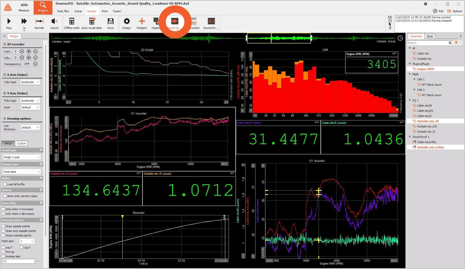
In DewesoftX you can see the duration of the file in the Analyze grid

In the data file, you can see the time if you add the formula which presents relative time

But for some files, this might be problematic because the relative time doesn’t start with zero. 

One way to calculate the duration is to add the following formulas

Let’s see how to do it with the AI

  • Open the file, and export just the first channel with it a resample, for example, 1024 Hz to have a smaller file

  • Open with the AI and just ask the question: What is the duration of the data file?

After some attempts the result will be:

The data is now correctly loaded, with "Time (s)" and "AI 1/2RO (g)" as the columns. I will now calculate the duration of the dataset by finding the difference between the last and first timestamps in the "Time (s)" column. The duration of the data in the file is approximately 26.74 seconds. This is the time span covered by the data, from the first recorded timestamp to the last. 

What is the maximum value amplitude and at which frequency of the  “2RO/AmplFFT” channel within the frequency range of 5672 Hz to 6239?

DATA FILE: FFT-analyzer_Electric-engine.dxd (see description of the datafile)

Add MAX marker on 2D graf. Enable marker table. The frequency and the amplitude are visible in the table

 We have to export the FFT channel, which when exported has a different file format than the standard channel, it is organized in 2 rows one for the Freq (Hz) and one for the FFT analyzer 1/2RO/AmplFFT (g (Z  peak)) Voltage. So we must give this information to the AI to correctly use the file.

Let’s do it with the AI:

  • The data in the file starts with 8 lines of headers that are not required for the analysis. We begin by skipping these lines and loading the remaining data into a format that can be manipulated.

  • Transformation: The data is initially arranged with frequencies in the first row and amplitude values in the second row. Our goal is to convert these two rows into two separate columns: one for frequency and one for amplitude.

  • Result: After the transformation, we generate a plot with the frequency on the x-axis and amplitude on the y-axis to visualize the data.

Step-by-Step Instructions with the Exact Prompts:

Begin by uploading the file to the system. Once the file is uploaded, use this prompt to read and skip the first 8 lines. In the next section you will see an optimized version of this prompt that works with multiple channels:

  • Skip the first 8 lines of the file during loading (if you don’t flag the export header you can avoid it)

  • Use the first value in the first row as the header for the first column (Frequency).

  • Use the first value in the second row as the header for the second column (Amplitude).

  • The remaining values in the first row become the values for the "Frequency" column.

  • The remaining values in the second row become the values for the "Amplitude" column.

  • Remove any unnecessary rows and clean the data.

Now the AI has a clean dataset to work on. Let’s ask:  What is the maximum value amplitude and at which frequency within the range of 5672 Hz to 6239 Hz?

The answer will be something like: 

The maximum amplitude within the frequency range of 5672 Hz to 6239 Hz is approximately 0.0691, and it occurs at a frequency of 5910.94 Hz

Let’s ask for a graph: Please plot a graph with the peak: 

Here is the plot of amplitude versus frequency within the specified range (5672 Hz to 6239 Hz), with the peak amplitude highlighted. Let me know if you need any further adjustments!


Now please plot the max peak for the full dataset

Can we get the maximum of all the FFT channels (“2RO/AmplFFT”, “2AX/AmplFFT”, “3RV/AmplFFT”, “3AX/AmplFFT”?

DATA FILE: FFT-analyzer_Electric-engine.dxd (see description of the datafile)

Enable Max hold. 

This will create “Overall Max FFT” channels for all inputs. You can present this data on a 2D graph. Note that this will be calculated on the whole spectrum so you have to limit Frequency to a similar frequency as on FFT Graph. 

Cross-channel array statistics will allow you to get MAX. (But you have to enable this in the Settings first). The same as before the output will be named as “Max value”. This will be vector from 0Hz to 12798Hz which is not out interest as we know that the operating frequencies are between 5672Hz and 6239Hz. 

You can find the maximum of the “Max value” vector with Math. MAX searches for the maximum value in the vector. MAXPOS searches for the position (in our case Frequency) at which the MAX appears. 

… but the result will be biased as the beginning and end of the data file have values that don't interest you. You will add those formulas

To limit the searching area you will limit the input vector to that region 

5672 / 1,56 = 3635,897 

6239 / 1,56 = 3999,359 

1,56 is Df or the resolution of FFT

So you will modify formulas according to this. 

In the screenshot, you can see that the overall amplitude value belongs to “2RO/AmplFFT” channel and complies with the MAX marker. 

Let’s try with the AI with the right prompt:

  • Skip Initial Rows: Skip the first 8 lines while loading the file.

  • Reshape Data: Use the first value of each row as the header for the columns. Place the remaining values of each row under their corresponding new column headers.

  • Data Cleaning: Remove any unnecessary or incomplete rows (e.g., rows with missing values or NaNs).

  • Output: Return the cleaned and structured data.

Please, Plot a graph between 5672Hz and 6239Hz

Here is the graph showing the FFT analysis between 5672Hz and 6239Hz for the different channels. 


Can you calculate the max amplitude?

The maximum amplitudes for each FFT channel within the frequency range of 5672Hz to 6239Hz are as follows:

FFT analyser 1/2RO/AmplFFT (g (Z peak)): 0.069116

FFT analyser 1/2AX/AmplFFT (g (Z peak)): 0.052397

FFT analyser 1/3RV/AmplFFT (g (Z peak)): 0.004412

FFT analyser 1/3AX/AmplFFT (g (Z peak)): 0.004497

Let me know if you need further analysis!

Can you calculate the max frequency?

The frequencies corresponding to the maximum amplitudes for each FFT channel within the range of 5672Hz to 6239Hz are:

FFT analyzer 1/2RO/AmplFFT (g (Z peak)): 5910.94 Hz

FFT analyzer 1/2AX/AmplFFT (g (Z peak)): 5970.31 Hz

FFT analyser 1/3RV/AmplFFT (g (Z peak)): 5782.81 Hz

FFT analyzer 1/3AX/AmplFFT (g (Z peak)): 6101.56 Hz

Let me know if you'd like further details!

Can you visualize the amplitude distribution?

Here is the amplitude distribution for each FFT channel in the frequency range between 5672Hz and 6239Hz. The histograms show how the amplitude values are distributed for each channel

Please plot of amplitude versus frequency within the specified range (5672 Hz to 6239 Hz), with the peak amplitude highlighted and the peak values in the plot

Here is the plot of amplitude versus frequency between 5672 Hz and 6239 Hz, with the peak amplitudes highlighted and their corresponding frequency and amplitude values labeled on the graph.

How many peaks are above 2 Volts?

DATAFILE: Sound_signal.dxd The data file has a lot of peaks at different amplitudes. 

We’re wondering how many peaks are above 2 Volts. Firstly we have to create a formula that will return rising edges when the peak is higher than 2 V. 

The red signal represents rising edges. 

The next step is to count the number of red peaks and output this as a single value, so no matter the yellow cursor the value will be the same. 

The formula will return 4. 

Let’s try with the AI:

Let’ export as usual the data, for the channels we need, in this case just the first channel AI 1

This export is not an FFT so is already in column and the header is made of just 7 lines (but during the export you can avoid it removing the flag), so the prompt will be extra simple. Let’ ask first for all the peaks above 2 Volts (21):

  • Skip the first 7 lines while loading the file.

  • Plot a graph showing the relationship between Time (s) and AI 1 Voltage, highlighting the peaks above the 2 Volts and tell me how many are

The graph shows the relationship between Time (s) and AI 1 Voltage, with the peaks above 2 volts highlighted in red. The number of peaks above 2 volts is 21.

Now ask just for the max peaks (4) if you like:
Plot highlighting the max peaks above the 2 Volts and tell me how many are

The graph highlights the maximum peaks above 2 volts, marked in red. The number of maximum peaks above 2 volts is 4.


What is the value of the AI 1 signal at the third peak?

DATAFILE: Sound_signal.dxd

Following the previous post-processing you have to create a formula that will count peaks but this time the output shouldn’t be a single value but rather a normal sync value. 

The next step is to latch/hold the value at the third peak. We can output the value as a single value. 

You can see the same value comparing the digital meter if you manually position to third peak with your mouse pointer. 

Let’s try with the AI:

Let's export as usual the data, for the channels we need, in this case just the first channel AI 1

This export is not an FFT so is already in the column and the header is made of just 7 lines (but during the export you can avoid removing the flag), so the prompt will be extra simple :

  • Skip the first 7 lines while loading the file.

  • Plot a graph showing the relationship between Time (s) and AI 1 Voltage, highlighting only the top peaks

  • Find the value of the third max voltage peak from the left in the graph, based on the voltage over 2 volts?

Here is the plot showing the relationship between Time (s) and AI 1 Voltage, with the top peaks highlighted.

The value of the third maximum voltage peak from the left, based on the voltage being over 2 volts, is approximately 2.06 volts. Let me know if you need anything else!

What is the exact number?

The exact value of the third maximum voltage peak is 2.05535888671875 volts.

Please, plot a graph and highlight it

Here is the plot with the third maximum voltage peak highlighted in red. If you need any further analysis or adjustments, feel free to let me know!


When given detailed instructions, ChatGPT can analyze, describe, and plot data. However, it can sometimes produce incorrect results in its data interpretation, so it is highly recommended that you double-check the results.